Statistics view
Visualise patterns with heatmaps, charts, and timelines.
NOTE: This view is currently under development and will be updated soon to provide broader visualization options.
The statics view provides statistical visualisations that help you discover patterns in your data. It is especially useful when your project includes metadata fields (see adding metadata), as you can see how metadata values are distributed across categories.
Choosing a visualisation
The view offers three visualisation types, selectable from the header:
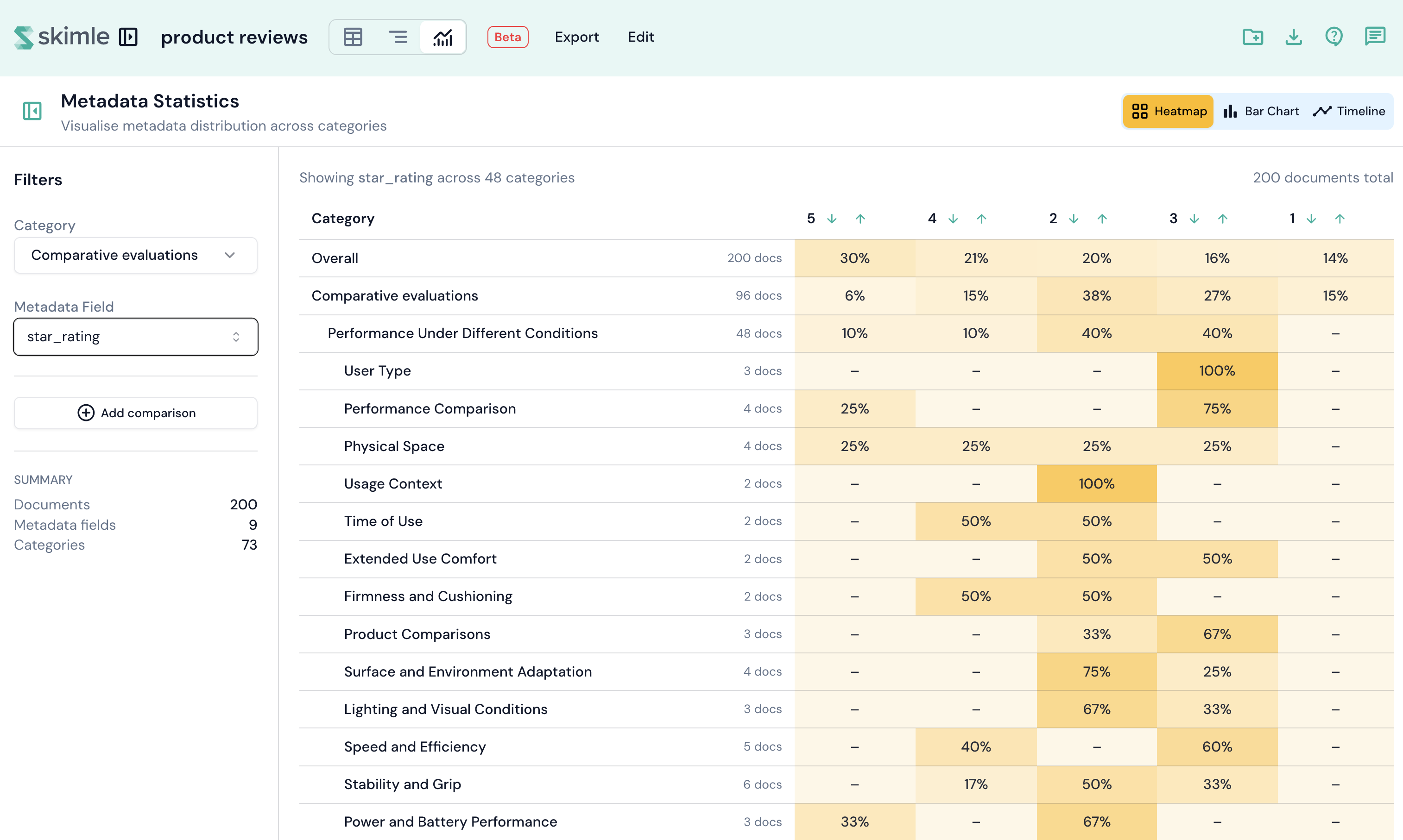
Heatmap
A colour-coded grid showing the frequency of metadata values per category. Rows represent categories and columns represent metadata values. Darker colours indicate higher frequency. You can sort rows and enable a comparison mode to view two fields side by side.
Bar chart
Traditional bar charts comparing metadata distributions across categories. Useful for categorical comparisons, especially when you want to compare a primary and secondary field.
Timeline
A temporal visualisation for date-based metadata fields. It shows trends over time and lets you control the aggregation level: day, week, month, quarter, or year.
Filters
A collapsible panel on the left lets you configure the visualisation:
- Category — select which insight category to analyse. Defaults to the first root category.
- Metadata field — choose which metadata field to visualise. Skimle selects the most suitable field by default.
- Comparison mode — enable side-by-side comparison with a second category or metadata field.
- Date aggregation — for date fields, control how dates are grouped (day, week, month, quarter, year).
Collapse the filter panel to maximise the chart area when you have found the view you need.