
Metadata variables are the facts you know about each document beyond its text, such as product it talks about, date, score given, author, gender, region etc.
Having metadata (also known as document variables in MAXQDA; case and file classifications in NVivo; and document attributes in ATLAS.ti) opens up new possibilities for viewing and analysing data. You can do quantiatative comparisons to discover patterns (e.g., do men and women bring up different themes) and create heatmaps, and in Skimle also study differences qualitatively (e.g., do men and women talk differently about the same topic?).
It is easy to work with metadata in Skimle. When uploading data, you can import them directly from a spreadsheet using the Tabular data source, or let Skimle infer them from other document types (e.g., date of the document, name based on the title etc.). Once the documents have been uploaded you can edit all the metadata fields, and add new information either manually, or with AI based on e.g., analysing the document contents or grouping other metadata values into bands like NPS Detractors and Promoters.
Imagine you are analysing 300 survey responses, 60 interview transcripts or a year of customer feedback, and you have run your thematic analysis. The main themes are clear. Then the follow-up questions arrive. Are unhappy customers complaining about different things from happy ones? Did something change in February? Do public sector respondents have different priorities from private sector ones?
Answering those questions means splitting the analysis by a variable. Traditional tools let you sort by a variable, but you still have to read everything again to see what differs. Skimle's metadata features handle both halves of the job: getting good variables onto your documents, and showing where those variables explain real differences in what people say. This guide walks through the whole flow on one real dataset, with screenshots from the current version of the product.
The 80-second video below shows the whole flow on the dataset used in this guide, from the raw spreadsheet to comparisons by NPS group and by product.
What are metadata variables in qualitative analysis?
In Skimle, metadata is structured information attached to each document in a project. A document might be an interview transcript, a survey answer, a support ticket or a report. Metadata is everything you know about it beyond its content: who produced it, when, in what context and from which segment.
Typical examples:
- Customer research: response date, product, subscription tier, country, NPS score
- Employee research: department, tenure, role level, office location
- Academic fieldwork: interview date, participant gender, organisation type, sector
- Document analysis: publication date, author organisation, document type, region
Some variables arrive with the data, and others can only be read from the text, such as the sentiment of a comment or the role the speaker describes. Skimle handles both kinds in the same table.
The worked example: 900 media customer comments
To keep this concrete, every screenshot below comes from one project: 900 open-text comments from subscribers of a fictional media company that sells a newspaper, a magazine, an online edition and a TV service. Each row of the spreadsheet holds a date (January to August 2026), the product, an NPS score from 1 to 10 and the comment itself. 225 of the rows have a score but no comment, which is normal for survey data and matters later.
Skimle's automatic analysis turned the comments into 422 insights in 10 categories and 70 subcategories, from "Content quality and journalism" to "Service reliability, outages and delivery issues". The rest of this guide is about splitting those themes by variables.
How do you get metadata variables into Skimle?
There are five routes, and most projects use more than one.
1. Import spreadsheet columns as metadata
The fastest route is to bring the data in as a CSV or Excel file. When you add a Tabular data source, Skimle shows a preview of the first rows and proposes a mapping for every column: which one is the content to analyse, which is the title, which are metadata and which to ignore. It also guesses the type. In this example it recognised the date column as Metadata - Date and the NPS column as Metadata - Number without being told.
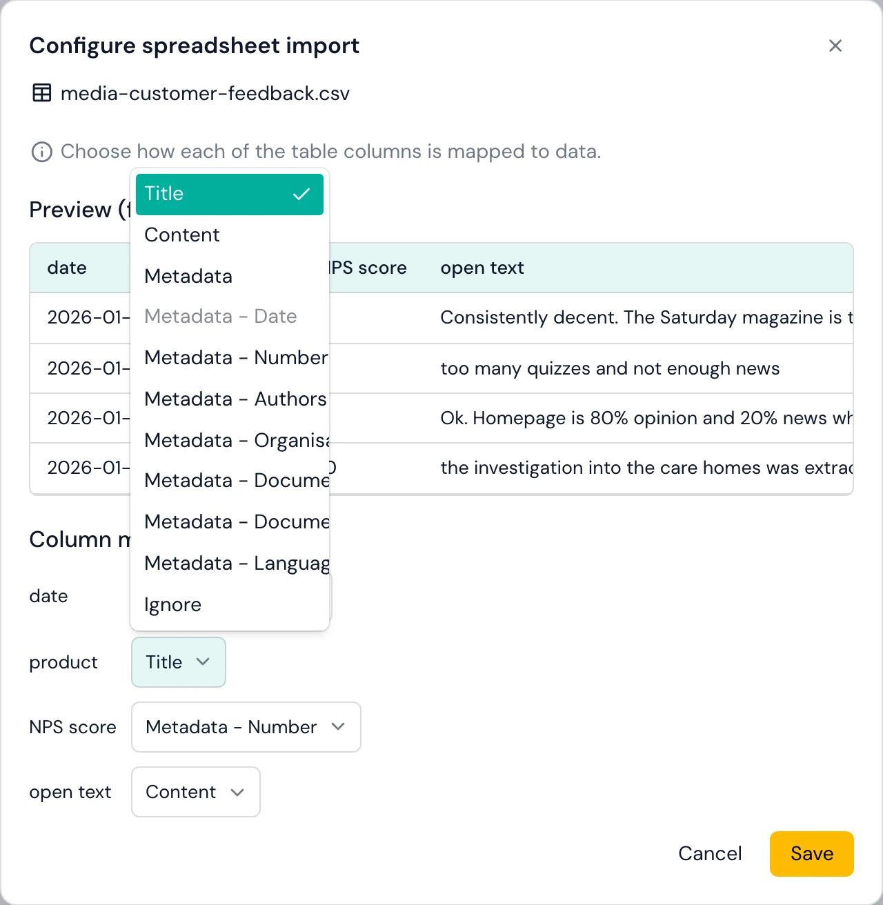
Getting the types right at import pays off later. Number fields can be grouped arithmetically, and date fields unlock the timeline views. Only the content column is analysed, so the other variables stay available to explain differences in the comments. The supported formats page covers the details of tabular import.
2. Let Skimle suggest and fill new fields from the text
Some variables are not in the spreadsheet but are in the text. Click Add metadata field and Skimle offers Suggestions. Some are proposed by your own documents, with a note of how many documents proposed each one, and others come from a catalogue of fields that are common in research data: Sentiment, Emotional intensity, Speaker role and Recency.
Picking Sentiment fills in a name, four allowed values (Positive, Mixed, Negative, Neutral) and a one-line instruction. You can edit any of them. Before committing, Preview reads a small sample of documents and shows what the field would say for each, so you can check that your instruction works before Skimle reads the whole corpus.
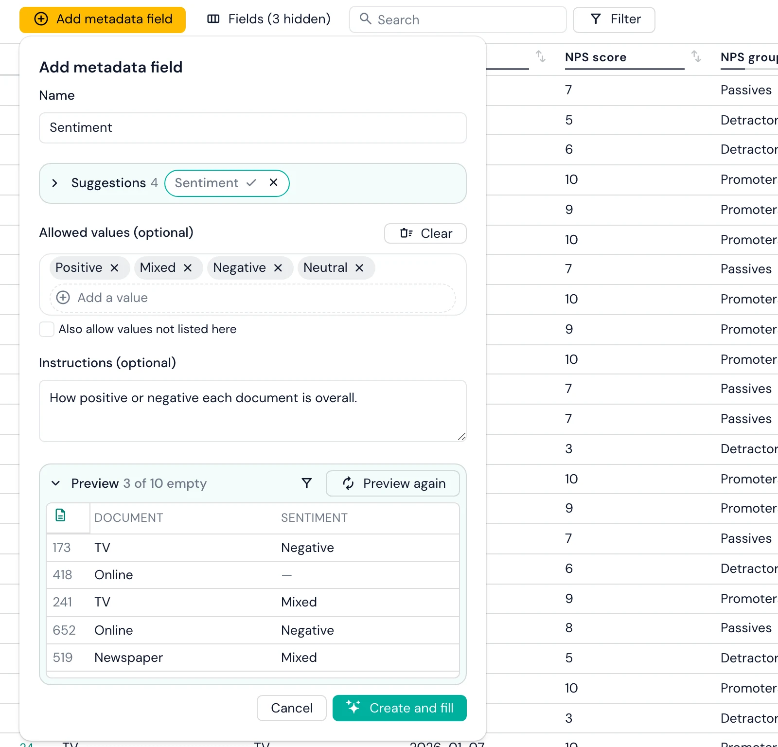
Create and fill then reads every document and fills the new values based on the analysis. Think of it as a skilled and pedant research analyst sorting through the pile of documents one by one to infer the most describing value for the metadata field you created.
My favourite things to try
- Is X mentioned. "Does the document mention Finland" and allowed values "Yes" and "No" allows creating a quick field to test. Skimle would infer this smartly so e.g., different spellings would normally not confuse it.
- Seniority of respondent "What is the seniority of the person being interviewed?" with e.g, "Executive", "Senior", "Junior" allows to sort between feedback based on seniority level. Skimle would infer this based on e.g. the title or background section of the interview.
3. Group raw values into meaningful bands
Raw values are often too fine-grained to compare. An NPS score has ten values, but the question managers ask is about Detractors, Passives and Promoters. The Net Promoter System defines Promoters as scores of 9-10, Passives as 7-8 and Detractors as 0-6.
Click a field's name, choose Group this field's values, and the grouping desk opens. Skimle can propose groups for you. You can also add your own and drop values into each one, as we did here: scores 1-6 into Detractors, 7-8 into Passives and 9-10 into Promoters. The desk shows how many documents each group holds as you go (415, 236 and 249), and you can write the result into a new field so the raw score stays untouched.
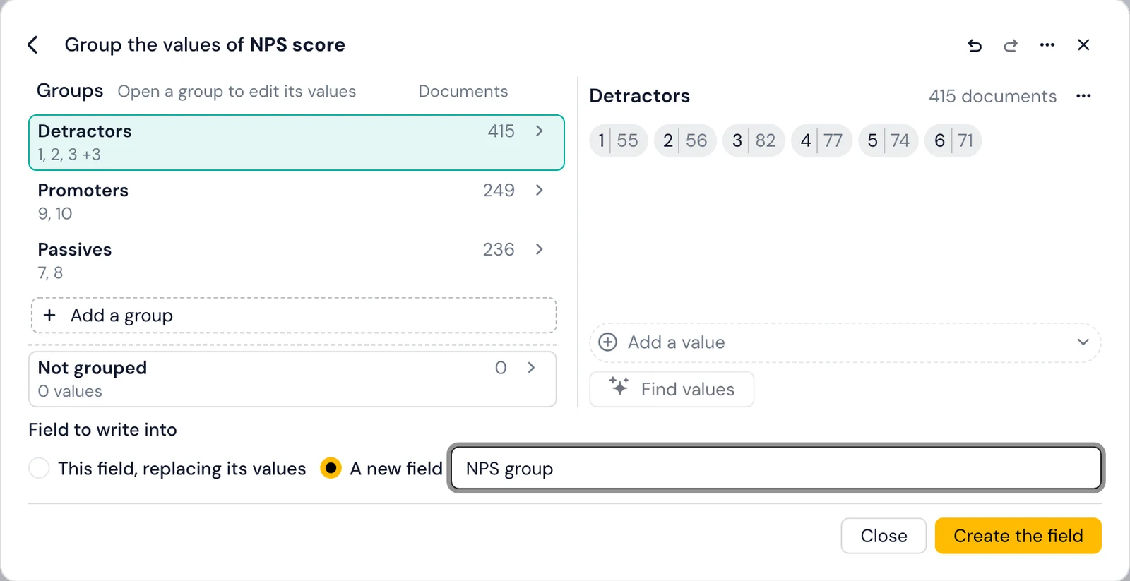
The same desk handles messier cases. You can fold dozens of free-text job titles into a handful of role families, merge "UK", "U.K." and "United Kingdom", or band ages into ranges. Where the group names are numbers, Sort into my groups places each value arithmetically. Every move can be undone before you save.
4. Check and correct values in the metadata editor
The metadata editor is a spreadsheet of documents against fields, and it is where AI-filled values get checked. Search and Filter narrow the table: a filter is a field, a condition (is, is not, is empty, is not empty) and a value, and filters combine. Fields shows each field's coverage (for example 674/900) and hides fields that are empty, identical everywhere or unique to every document, which declutters an imported project quickly.
A useful check is to filter for combinations that should be rare. In our project, filtering for NPS group is Detractors and Sentiment is Positive left 2 of 900 documents. They said e.g., "few outages, otherwise fine", which is a fair reading.
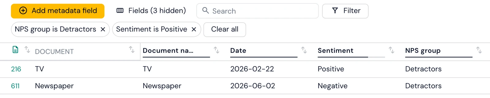
AI-inferred metadata should be reviewed like any other AI output, especially on fields where a wrong value would quietly shift a comparison.
5. Round-trip through Excel for bulk changes if needed
For e.g., matching documents to an existing table with more metadata, you can optionally Export the metadata to Excel, edit it there (adding columns if you need them) and Import it back. Skimle matches rows to documents by ID first and document name second, previews new fields, changed cells and deletions, and applies them only when you confirm. Columns the project does not have yet become new fields. The adding metadata documentation covers both directions.
Getting this part right is most of the work. If you analyse survey and feedback data for clients or a product team, see how this fits customer and market research workflows.
How do you find patterns across metadata variables?
With the variables in place, Skimle offers two routes to what they reveal: automatic pattern detection in the categories view, and the Visualisations section for exploring them yourself.
Automatic pattern detection in the categories view
Run Analyse metadata from the categories view and Skimle checks every categorical field against your categories. It combines two signals: whether the insights from different groups are semantically different (using their embeddings), and whether insights from some groups cluster disproportionately in certain subcategories. A field is reported only when both signals agree, which keeps spurious findings out. Where a field qualifies, it appears in the category summary with a plain-language description of how each group differs, and fields that show no difference are not shown at all.
Which categories differ by group? The Metadata explorer
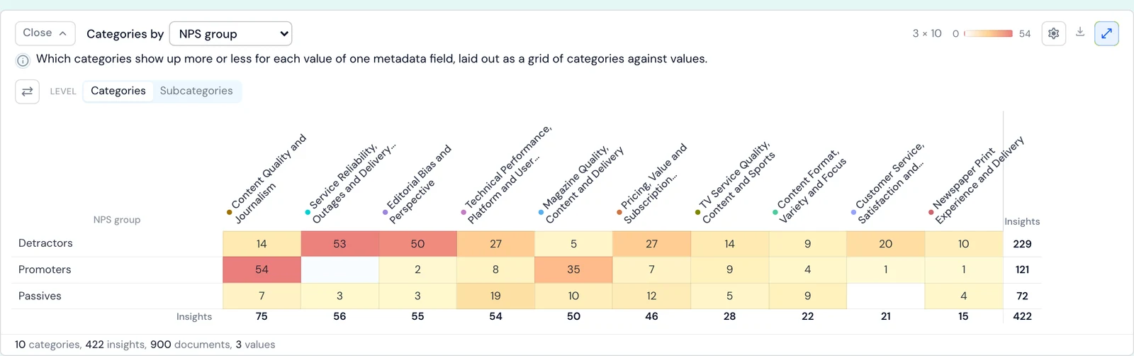
The Metadata explorer lens in Visualisations starts with Metadata distribution: every field with its number of values and its coverage, and a chart of how documents or insights spread across the field you pick. Below it, Categories by lays out a heatmap of categories against the values of one field.
With NPS group selected, the heatmap separates the two ends of the scale clearly. Detractors' insights concentrate in "Service reliability, outages and delivery issues" (53) and "Editorial bias and perspective" (50). Promoters' insights concentrate in "Content quality and journalism" (54) and "Magazine quality, content and delivery" (35). Clicking any cell opens the insights behind it, so every number can be read back to the comments.
How much more common is a theme in one group? Quantitative comparison
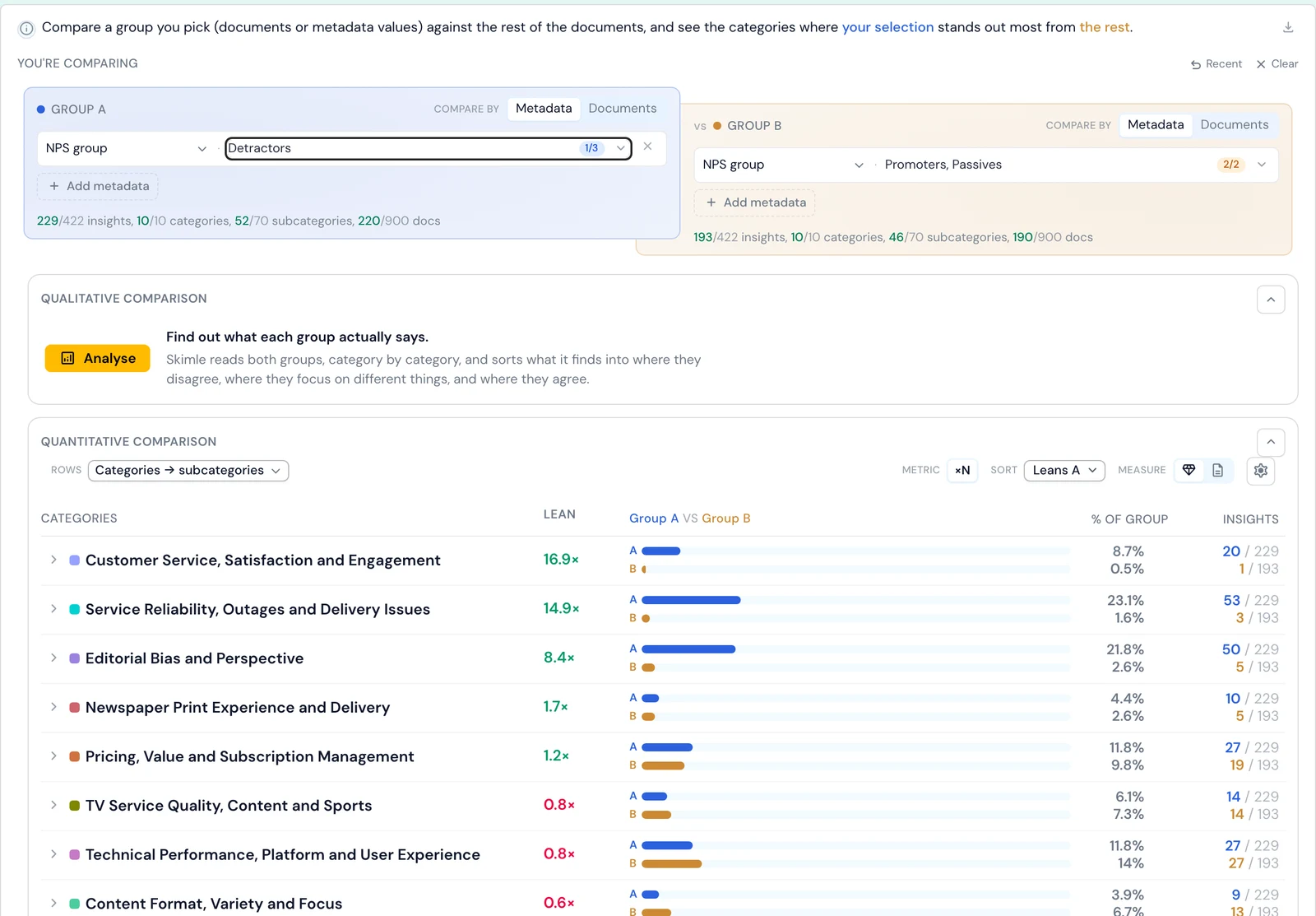
The Comparison lens contrasts one group with another. Pick Group A by metadata values or by documents. Group B defaults to everyone else, or you can pin it to a group of your own. The table then ranks every category by how strongly it leans towards one side, using one of three metrics: percentage-point difference, times as common, or odds ratio.
Comparing Detractors (220 documents with insights) with Passives and Promoters (190):
| Category | Detractors | Passives and Promoters | Times as common |
|---|---|---|---|
| Customer service, satisfaction and engagement | 8.7% | 0.5% | 16.9× |
| Service reliability, outages and delivery issues | 23.1% | 1.6% | 14.9× |
| Editorial bias and perspective | 21.8% | 2.6% | 8.4× |
| Pricing, value and subscription management | 11.8% | 9.8% | 1.2× |
"Outage complaints are fifteen times as common among Detractors" is a far sharper line for a leadership deck than a heatmap cell.
What does each group actually say? Qualitative comparison
Counts tell you where the groups differ in volume, but not when they talk about the same topic in opposite terms. Pricing is the example here: it is roughly as common among Detractors as among everyone else (1.2×), so a count-based view would call it a non-difference.
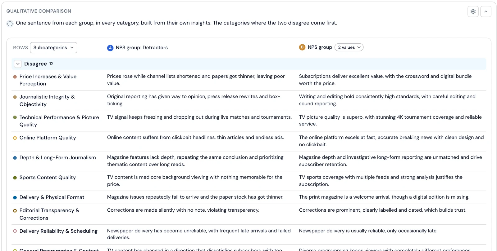
The Qualitative comparison above the table answers that question. Press Analyse and Skimle reads both groups' insights category by category and writes one sentence per side. It then sorts the rows into where the groups disagree, where they have a different focus, and where they agree. For pricing it found a clear disagreement:
Detractors: "Prices rose while channel lists shortened and papers got thinner, leaving poor value."
Passives and Promoters: "Subscriptions deliver excellent value, with the crossword and digital bundle worth the price."
An important safeguard is built in to avoid bias: The model sees only "A" and "B", never which group is which. Every sentence is built from insights you can open, with the passage behind each. Rows resting on a single document are flagged as one person's view rather than the group's.
When did it change? The Timeline lens
If your documents carry a date, the Timeline lens shows how categories or metadata values move over time. Timeline trend draws them as lines, split panels, bars, a matrix or stacked areas, over a date range and period you choose. In this project one line stands out: "Service reliability, outages and delivery issues" jumps in February 2026, when 30 TV subscribers wrote about the signal dropping out, and then falls back. Grouping all months together would hide that spike entirely.
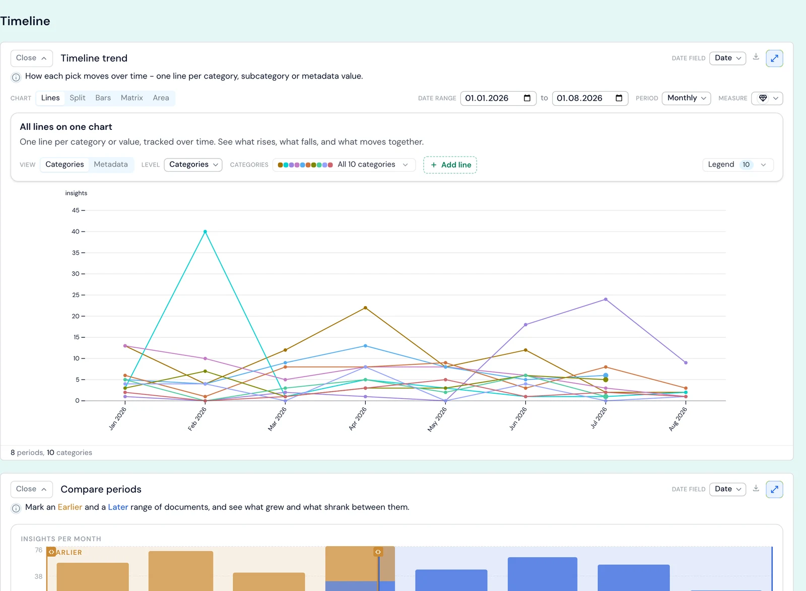
Compare periods sits beneath it. Mark an earlier and a later range on a calendar strip and Skimle shows which categories grew and which shrank. Use compare periods to contrast two stretches of time, and the comparison lens to contrast two groups of people. The timeline trend and compare periods chapters cover both in detail.
Controls that apply everywhere
Most blocks share the same controls: Level (categories or subcategories), Measure (count insights or documents) and Metric (counts or shares). Filter in the top bar narrows the whole of Visualisations to a subset of documents, categories or metadata values. Export copies any chart as an image or downloads it as a PNG or CSV. Clicking a metadata value in one lens carries it into the comparison, so moving from "that looks odd" to a quantified contrast takes one click. A per-block reference sits in the Visualisations settings documentation.
An academic example: interviews with organisational variables
Metadata analysis works the same way for interview research. Suppose you have run 45 semi-structured interviews with managers about digital transformation, across large and small organisations in the public and private sectors. You set up fields for organisation size, sector and interview date, the last one to track whether the narratives shifted during data collection. After transcribing the recordings in Skimle and running the analysis, your categories include "Leadership and vision", "Resource constraints", "Employee resistance" and "Technology choices".
The metadata analysis might show that:
- Organisation size explains "Resource constraints": small organisations talk about procurement and budget cycles, large ones about internal governance and approvals.
- Sector explains "Technology choices": public sector respondents cluster around compliance and interoperability, private sector respondents around speed to market and vendor relationships.
- Interview date matters for "Leadership and vision": interviews held after a major regulatory announcement frame transformation priorities differently from earlier ones.
Each of these would take days of manual comparative coding, and you would likely miss the ones you were not looking for, because every comparison run by hand costs effort. Here they surface as part of the normal workflow. Once a pattern appears, you can probe it in your next interview, which gives theoretical sampling a shorter feedback loop and pairs well with grounded theory. The same logic extends to field notes tagged by site, role and session date in ethnographic studies. For thesis and publication work, see how Skimle fits academic research.
When is metadata analysis most useful?
Metadata analysis earns its place when:
- The dataset is large enough for groups to hold several insights each. The qualitative comparison needs at least three insights on each side.
- The research question compares segments: customer tiers, NPS groups, regions, roles, sectors or time periods.
- The study is longitudinal or repeated, and you want to track change rather than describe one moment.
- Documents come from different sources (channels, sites, interviewers), and you want to know whether the source explains what is said. Combining customer insights across feedback channels explains why a channel field is often the most valuable variable you can add.
It is less useful for small, homogeneous datasets where the variables explain little. In that case Skimle reports no significant fields rather than manufacturing a result.
A caution: a variable that separates the groups tells you a difference exists, not why. Small groups are the usual trap. A difference resting on eight documents is a lead to investigate, not a finding to report, which is why Skimle flags single-document rows. Open the insights and read them before you write anything down.
Frequently asked questions
What is a metadata variable in qualitative research?
A metadata variable is a structured attribute of a document that sits outside its text, such as the participant's role, the interview date, the product a customer uses or their NPS score. In software such as NVivo these are often called attributes or case classifications. They let you split qualitative findings by group and compare what different segments say.
Can AI fill in metadata variables from the text?
Yes. In Skimle you describe a field, for example Sentiment or Speaker role, preview its values on a sample, then let Skimle read every document and write a value. Documents with nothing relevant are left empty rather than given a guess. You should still review AI-filled values, for example by filtering for unlikely combinations, as with any AI output.
How do I group NPS scores into Detractors, Passives and Promoters?
Open the NPS score field, choose Group this field's values, create three groups and put scores 0-6 into Detractors, 7-8 into Passives and 9-10 into Promoters. Write the result into a new field so the raw scores stay intact. Our guide to analysing NPS verbatim comments covers what to do with the groups once you have them.
What is the difference between quantitative and qualitative comparison in Skimle?
The quantitative comparison counts how often each category appears in two groups and ranks the categories by the gap. The qualitative comparison reads what each group says within each category and reports where they disagree, focus on different things or agree. A category can be equally common in both groups and still be described in opposite terms, which only the qualitative comparison shows.
Where does metadata analysis fit in the Skimle workflow?
Metadata analysis sits downstream of your core thematic analysis. You do not need it to get value from Skimle, since categories, summaries and insights are useful on their own. But it answers the "who says what" question that follows every first read-out, and it is hard to do at scale by hand.
It works across languages, so you can hold documents in several languages in one project and still compare groups. Skimle Ask collects AI-led interviews with participant metadata already attached. The same approach scales to public data: our analysis of 242 reviews of NVivo, ATLAS.ti and MAXQDA is one metadata cut, themes by product, applied to G2 reviews. For setups where agents read structured metadata and insights directly, see agentic chat and MCP.
Ready to find out who says what in your own data? Try Skimle for free and import a spreadsheet with its variables already attached. Whether you are working with customer feedback, interview transcripts or document archives, you can split every theme by every variable without re-reading the data.
Want to learn more? Read our guides on analysing customer feedback with Skimle, customer sentiment analysis and importing and exporting data with Skimle.
About the authors
Henri Schildt is a Professor of Strategy at Aalto University School of Business and co-founder of Skimle. He has published over a dozen peer-reviewed articles using qualitative methods, including work in Academy of Management Journal, Organisation Science, and Strategic Management Journal. His research focuses on organisational strategy, innovation, and qualitative methodology. Google Scholar profile
Olli Salo is a co-founder at Skimle and former Partner at McKinsey & Company where he spent 18 years helping clients understand the markets and themselves, develop winning strategies and improve their operating models. He has done over 1000 client interviews and published over 10 articles on McKinsey.com and beyond. LinkedIn profile