
You have a spreadsheet. It has a thousand rows. Each row is a customer telling you something about your product: what they love, what frustrates them, what broke last week. You scroll through it for twenty minutes, nod at the patterns you already suspected, and close the tab. You never quite get to the part where the data surprises you.
This is the situation most product managers are in. Customer feedback arrives constantly, whether from support tickets, NPS surveys, in-app prompts, or App Store reviews, and it piles up in tables that nobody has the time to properly dig through. Keyword searches and word clouds help a little. Pivot tables help a bit more. But neither tells you whether a new cluster of complaints is a statistical blip or the early signal of a systemic problem.
This guide walks through how to bring that table of feedback into Skimle, set up your metadata properly, and let the analysis surface what manual scanning would miss. We'll use a fictional customer feedback dataset as the example throughout, including what it revealed about a specific product and a specific month that warranted immediate attention.
What Skimle does differently with feedback data
Most tools that promise to "analyse your customer feedback" are doing one of two things: counting word frequencies against filters you set up (classic approach), or running the data through a language model and asking it to summarise (basic AI approach). Both approaches have real limitations.
Word frequency misses context entirely. A customer writing "not bad" and a customer writing "actually pretty bad" look identical if you're counting the word "bad." Many existing tools before the era of AI started to develop sophisticated filters on top to spot these kinds of obvious gaps, but they still rely on being able to accurately predict what types of categories you have in your data. This means that if new things emerge, your existing filters will fail to catch them and they will live in the "other" bucket until you manually discover them.
Summarisation via a general-purpose LLM like ChatGPT can work, but the results are hard to verify, they don't connect back to source rows, and the model has no awareness of your specific product categories or time periods. You end up with confident-sounding output that you can't trust. With larger datasets you are sure to get hallucinations and will omit large sets of data, like we discuss in our article on how LLMs actually work.
Skimle takes a different approach. Rather than asking an LLM to write a summary and hoping for the best, it builds a structured representation of the data and organises it into themes that you can inspect, verify, and interrogate. Every insight links back to the specific responses that generated it. You can watch us discuss how the underlying analysis works if you want the full picture, but for now what matters is that the process is transparent and rigorous all the way through.
Importing your CSV
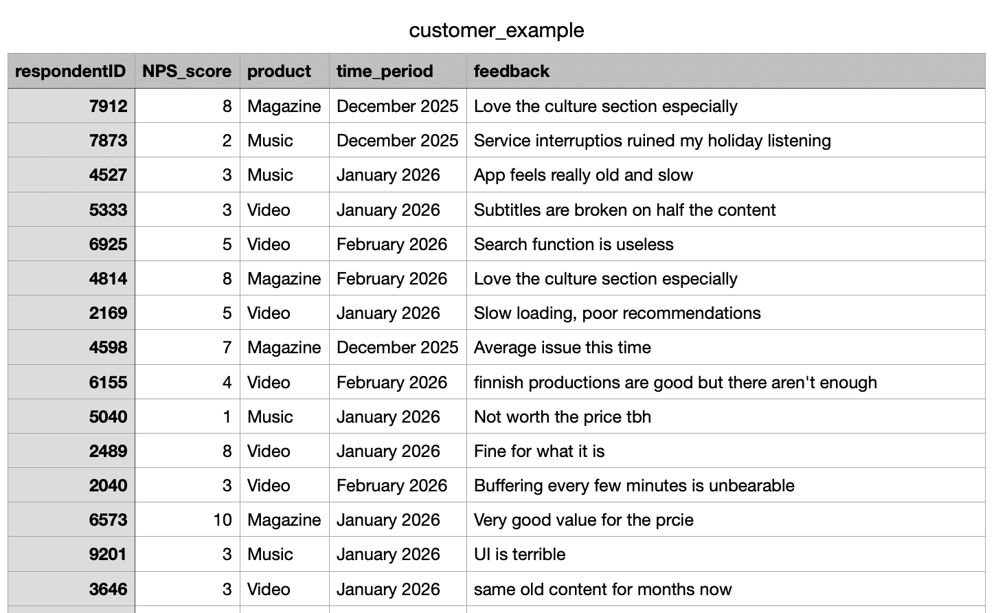
The starting point is your CSV file. In our example, we're working with customer_example.csv, which contains customer feedback collected across several product lines over several months. The columns include a respondentID, NPS (satisfaction) score, a product name, a submission date, and a free-text feedback field. The import handles quite large files comfortably. If you're working at scale with hundreds or thousands of responses, the process works the same way; it just takes a bit longer to process all the documents.
When you import a CSV into Skimle, the first step is identifying how the columns work. Help Skimle by defining what is the title (e.g., respondentID, email, ticket number or other identifier), what is metadata (variables associated with the document, e.g. time period, product used, channel, user gender or any other piece of data you have that might potentially explain differences) and what is content (the free text answer in our case) which Skimle will use to create the category structure.

Once these are set, every piece of feedback in Skimle carries its metadata alongside it. This means that when Skimle identifies a theme, you can immediately see how that theme distributes across products, months, or any other dimension you've imported. The metadata variables approach is one of Skimle's most practically useful features for exactly this reason: it turns a flat list of responses into a structured dataset you can explore.
You are not limited to what you set at import time. You can add or edit metadata on individual documents later, which is useful if you want to reclassify responses or add a manual "priority" tag after the initial analysis.
Letting Skimle identify themes
Once the import is complete and the metadata is mapped, Skimle runs the qualitative analysis. This is where things get interesting.

Skimle reads through all the feedback documents and builds a set of themes from the bottom up. It does not start with a predetermined category list and slot responses in. Instead, it discovers what categories actually exist in this dataset. This matters more than it sounds.
When you analyse customer feedback manually, you tend to find what you're already looking for. Your existing mental model of the product shapes what you notice. Skimle has no such priors. It treats every row the same way and builds its theme structure from what's actually there.
In our dataset, the analysis surfaced 14 distinct top-level themes, including expected ones like onboarding friction, pricing concerns, and feature requests. For each theme and sub-theme you get a summary with full links to source feedback documents and a listing of how many pieces of feedback relate to each category.

But it also surfaced something more specific: a cluster of responses pointing to technical reliability issues concentrated in one product area, and another cluster pointing to a service disruption during a particular month.
This kind of discovery, where the data surfaces a pattern you weren't specifically looking for, is what good qualitative analysis is supposed to do. The difference is that doing it manually across a thousand rows of feedback would take days rather than minutes.
Exploring by product: the Music and Video problems
With the themes identified, the next step is to cut the analysis by metadata. In Skimle, you can filter or compare the theme distribution across any metadata field.
For each category, Skimle automatically recognizes which metadata fields have significant differences.

For example, it's clear that the overall satisfaction related comments and feedback differ by product. Magazine is doing well, Music has technical problems and Video is a mixed bag.
We dig deeper to what is happening, and identify that Technical Errors, especially buffering, seem to have been a big issue in January based on the heatmap analysis.

This is the kind of signal that gets buried in aggregate analysis. If you look at technical complaints across all products, they might represent 5% of your total feedback, which sounds manageable. But if you drill down and find that 69% of those complaints come from one product in one time period, the severity looks very different.
The comparison view in Skimle lets you put two or more metadata segments side by side and see where their theme distributions diverge. Market researchers use this to compare audience segments; for product managers, the same capability lets you compare product lines, user cohorts, or geographies with a few clicks.

The date metadata opened up a second dimension of exploration. When we grouped the feedback by month and looked at how the theme distribution shifted over time, December 2025 stood out immediately.
The volume of responses mentioning outages, service unavailability, and inability to access content spiked sharply that month. The themes themselves were not new — service reliability had appeared as a minor theme in earlier months — but in December they moved from marginal to dominant within the dataset.
Crucially, this was not a finding that required any prior hypothesis. We did not go into the analysis asking "was December bad?" We went in asking "what is this data telling us?" and the temporal structure of the metadata made the anomaly visible.
This is the practical value of setting up date fields properly at import time. Without the date metadata, the December spike would have been invisible, dissolved into the aggregate theme counts. With it, you have a timeline that shows not just what customers are saying but when they started saying it.
For a product team, this kind of finding is immediately actionable. You know which product was affected (Music), you know when the complaints peaked (December 2025), and you have the specific verbatim feedback to understand exactly what broke. That is enough to open a proper post-mortem conversation with engineering, with real data rather than vague impressions. And if you do this type of analysis weekly or even daily, you don't have to wait for the feedback to show up in aggregate NPS numbers, you spot the emerging trends immediately.
Reading the reports
Beyond the theme exploration view, Skimle generates a set of reports that summarise the analysis across the dataset. These are useful for sharing findings with stakeholders who are not going to dig through the tool themselves.
The report for our customer dataset included:
- A summary of the top themes across all feedback, with the share of documents each theme appeared in
- Representative verbatim quotes for each major theme, linked back to the original response rows
The verbatim links matter. When you present findings to a sceptical audience, one of the first questions is always "can you show me the actual responses?" In Skimle, every theme and every report section links directly to the underlying documents. You are never working with a black box. The transparency model is built in at every level: from the high-level summary down to the individual response.
If you've ever had to defend a qualitative finding in a meeting with someone who doesn't trust AI tools, the ability to click through from "customers report audio playback failures" to the actual list of responses that generated that finding is genuinely useful.
Using Skimle as an ongoing feedback system
The workflow above describes a one-time analysis of a historical .csv table, but the same setup works as a continuous process. Each month's new feedback export can be imported as additional documents into the same project. The metadata structure stays consistent, and Skimle updates the theme analysis to reflect the new data.
This means the December spike does not just become a historical data point. As January and February data comes in, you can see whether the outage-related complaints are declining (which would suggest the issue was fixed) or persisting (which would suggest the fix didn't work, or that there are residual effects on customer trust).
For teams managing ongoing qualitative research of any kind, the ability to add documents incrementally without rebuilding the entire analysis from scratch is a significant time saving. You can also export your data and findings in various formats when you need to pass them to other systems or team members.
What this changes for product managers
The shift that Skimle enables is not primarily about speed, though it is faster than manual analysis. The more substantive change is what you can ask of the data.
With a spreadsheet and keyword search, you can answer questions you already have. You can search for "crash" and see how many responses mention it. What you cannot do is discover that there is a cluster of responses describing the same underlying problem using ten different words, or that the pattern you noticed is actually confined to one product segment and one time window.
Qualitative analysis done well is supposed to surface structure that was not obvious before you looked. That is genuinely hard to do at scale with manual methods. Tools like Skimle make it tractable by handling the pattern recognition computationally while keeping you in control of the interpretation.
The democratisation of this kind of analysis matters too. Not every team has a dedicated researcher who can spend a week working through feedback. With Skimle, a product manager can run a rigorous analysis themselves, in the same time it used to take to do a first pass.
Ready to dig into your customer feedback data properly? Try Skimle for free and see what your next CSV reveals beyond what you already expected.
Want to go deeper on the methodology? Read our guides on discovering themes using metadata variables and analysing open text responses at scale.
About the authors
Henri Schildt is a Professor of Strategy at Aalto University School of Business and co-founder of Skimle. He has published over a dozen peer-reviewed articles using qualitative methods, including work in Academy of Management Journal, Organisation Science, and Strategic Management Journal. His research focuses on organisational strategy, innovation, and qualitative methodology. Google Scholar profile
Olli Salo is a former Partner at McKinsey & Company where he spent 18 years helping clients understand the markets and themselves, develop winning strategies and improve their operating models. He has done over 1000 client interviews and published over 10 articles on McKinsey.com and beyond. LinkedIn profile