
You have 300 survey responses, 60 interview transcripts, or a year's worth of customer feedback. You've run your thematic analysis and you can see the main themes clearly. But now the real questions start arriving: are younger customers saying something different from older ones? Did sentiment shift after the product update in November? Do public sector respondents have different priorities from private sector ones?
This is where many qualitative tools leave you stuck. While with some tools you can sort data by metadata variables (e.g., manually in Excel or with Atlas.TI's tools), you still need to read through everything again and try to spot the differences.
Skimle's metadata features solve this. They let you attach structured variables to your documents and then automatically surface where those variables explain meaningful differences in what people are saying. Think of it as pivot tables for qualitative data: the same analytical power, but applied to themes and language rather than numbers.
This article explains how the feature works, when to use it, and what it looks like in practice.
What metadata is in Skimle:
In Skimle, metadata refers to structured descriptive information attached to each document in your project. A document might be an interview transcript, a survey response, a customer support ticket, or any other text. Metadata is everything you know about that document beyond its content: who produced it, when, in what context, from which segment.
Some examples:
- For customer research: response date, product used, subscription tier, country, age group
- For employee interviews: department, tenure, role level, office location
- For academic fieldwork: interview date, participant gender, organisation type, industry sector
- For document analysis: publication date, author organisation, document type, region
How to get the metadata values into my data?
There are multiple ways to get metadata into Skimle
Import data as .csv with metadata fields
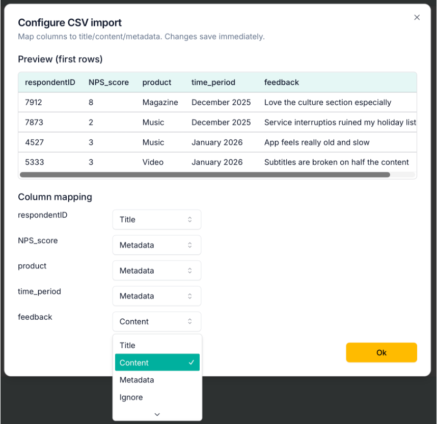
The easiest way is to bring in data as .csv tables (these can be exported easily with e.g., Excel). When loading the data to Skimle, you can define which fields to treat as metadata, which are content and which to ignore.
For a customer feedback dataset, you could set up the respondentID column as the title, NPS scores, products being used and time periods as metadata, and the written feedback as content as shown in the image below. This way Skimle will only do the thematic analysis based on the open text answers, and the other variables can be used to spot what explains differences in the verbatims.
Automatically recognise from imported documents
If you are importing interview transcripts, reports or other documents, Skimle will automatically identify metadata variables including a time period and author. It will also assess the overall sentiment of the document (positive, negative or neutral) as well as the language used.
Create custom metadata using AI
Once you have your project open, you can select Edit - Add new metadata fields... from the menu. In the opening dialogue, you can write instructions for Skimle on identifying new metadata fields based on the document contents. For example, you could ask it to infer if the person being interviewed represents a competitor, is a child or adult, or any other variable you could reasonably deduce from the document itself. Give clear instructions to the AI on how you want to call your variable and what different values it can take.
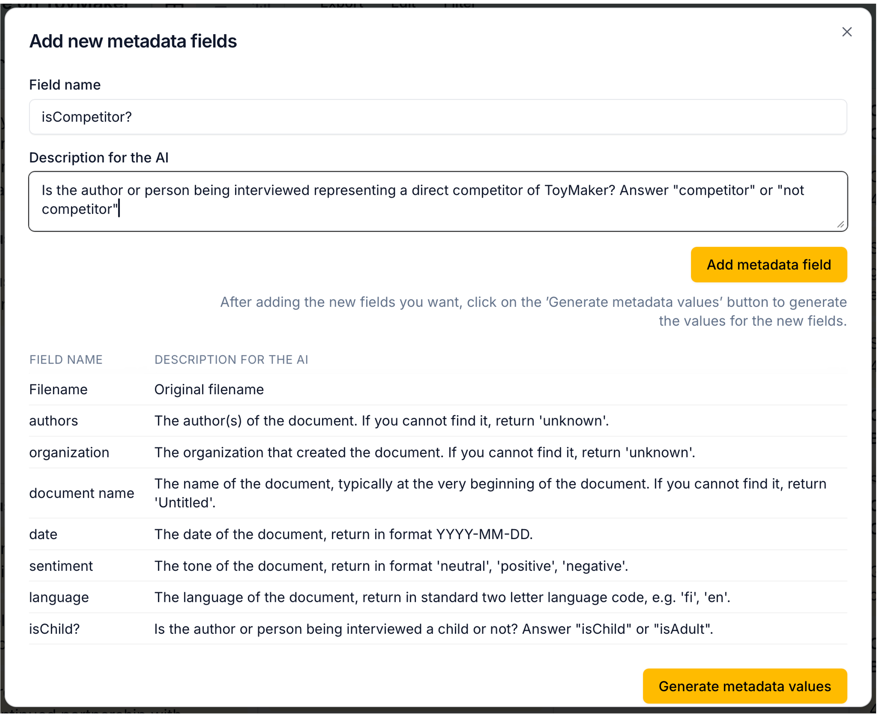
After creating the new fields, don't forget to ask Skimle to "Generate metadata values". This might take a few seconds for larger datasets as Skimle goes through each document and creates the value.
Metadata editor - coming soon
We're in the process of adding a manual metadata editor to allow adding, changing and deleting metadata variables and values. Stay tuned!
Discovering patterns with metadata
Once your metadata is populated, Skimle gives you two distinct ways to discover what it reveals: automatic pattern detection inside your category summaries in Category view, and a dedicated Statistics view for deeper exploration and quantitative analysis.
Automatic pattern detection in Category view
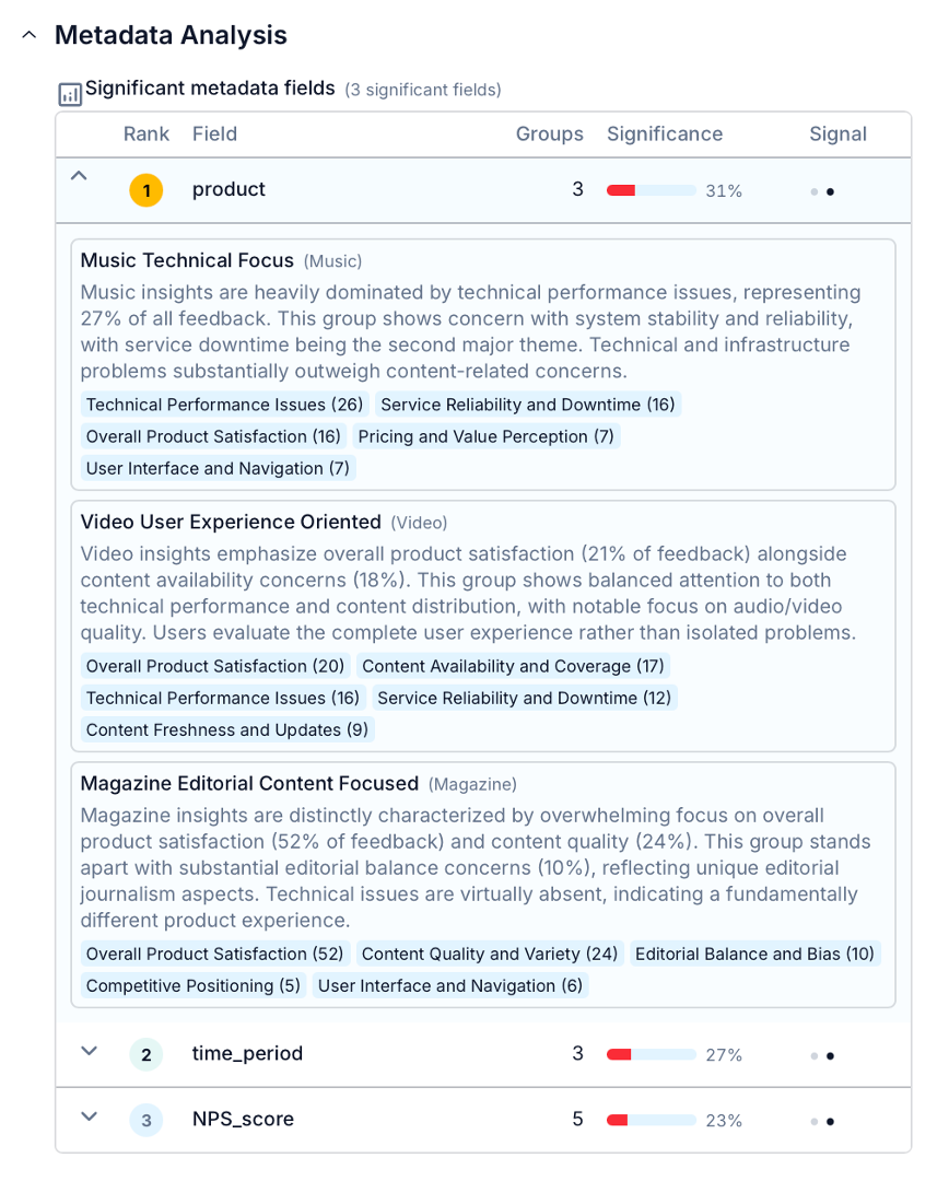
When Skimle generates or updates the summary for a category, it runs a background analysis to check whether any of your metadata fields explain meaningful variation in what people are saying within that category.
Technically this works through two complementary methods. The first uses the semantic embeddings of your insights to check whether the content expressed by different metadata groups is actually different (not just labelled differently). The second uses a statistical test (similar to a chi-square test) to check whether insights from certain metadata groups cluster disproportionately in certain subcategories. Together, they produce a significance score for each field.
If a field clears the significance threshold, Skimle surfaces it in the category summary with an AI-generated description of what distinguishes each group. In the example below, Skimle has identified that product feedback differs a lot depending on the product line, and makes a summary of how overall perceptions differ between Music, Video and Magazine products.
The automatic metadata analysis is done for the overall findings and each sub-category separately. If any of your metadata fields contain dates, Skimle compares for example recent answers versus older answers to spot temporal differences. If those exist, they are highlighted as well.
This appears directly in the category summary, alongside the main themes, so you see the "what" and the "who" in the same view. Fields that show no meaningful difference are not shown.
The Statistics view to analyse metadata differences
For a more quantiative exploration, the statistics tab gives you an interactive dashboard built specifically around your metadata fields. It has three visualisation modes.
Heatmap
The heatmap shows how insights are distributed across categories for each metadata value. Each cell represents the proportion of insights in a given category that come from a particular metadata group, with colour intensity indicating concentration.
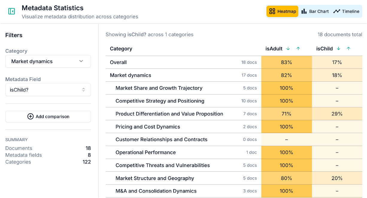
This is useful for a quick overview: you can scan across all your categories and metadata values at once and spot where the distribution is uneven. A cell that stands out immediately tells you that a particular group is over-represented in that category. In the example above, children were not really helpful in finding out things about the market dynamics - except when it came to the quality of toys they get!
Bar chart
The bar chart lets you compare two metadata values or two categories side by side. You can switch between absolute counts and normalised frequencies depending on whether you care about volume or proportion.
This is where most of the "wait, that's interesting" moments happen. You select a field, you select a category, and you see whether the distribution between groups is roughly equal or sharply divergent. A sharp divergence is a signal worth investigating in your category summaries.
Timeline
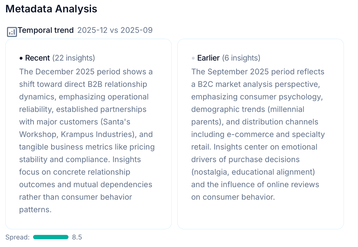
The timeline view is available when your project includes a date-type metadata field. It shows how the distribution of insights across metadata values has changed over time, with configurable aggregation (by day, week, month, quarter, or year).
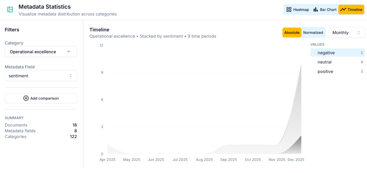
The timeline is particularly powerful for longitudinal studies and ongoing feedback programmes. A sudden spike in a particular metadata value, or a gradual shift in the balance between groups, often corresponds to something real: a product change, a policy announcement, a seasonal shift in who's engaging with your service. In the example above, negative comments related to Operational excellence only started to surface in December 2025, highlighting they are a recent issue. Grouping all the observations together would have hidden this growing trend.
A business example: analysing customer feedback over time
Suppose you run a media streaming service offering three products (Music, Magazine, Video) and you collect ongoing subscriber feedback. You have 300 responses gathered across December 2025, January 2026, and February 2026.
After running your analysis on open text responses, you have categories like "App performance", "Content quality", "Pricing", and "Customer support". You've set up three metadata fields: product, response date, and NPS score.
What the automatic analysis surfaces:
In the "App performance" category, Skimle flags that the Product field is highly significant. Music and Video subscribers dominate this category, and their feedback is semantically distinct from Magazine subscribers' content. It also detects a temporal pattern: the concentration of performance-related feedback from Music and Video subscribers peaks sharply in December 2025, then drops in January and February. (You know why: there was a service outage over the holiday period.)
In the "Content quality" category, the temporal analysis surfaces something different: Magazine subscriber feedback has shifted in tone across the three months. Recent responses are still largely positive but a small group of February respondents use language around editorial bias and changing editorial direction, distinct from the earlier, more uniformly positive feedback. The system flags this as a borderline-significant temporal shift and describes it in plain language.
What the statistics view adds:
In the timeline chart, you can see the December spike in "App performance" discussions from Music and Video subscribers very clearly: it accounts for nearly 60% of that category's insight volume in December, compared to under 30% in the surrounding months. You can share this chart directly with the product team as evidence of the outage's qualitative impact.
In the heatmap, you can cross-reference the NPS bracket with categories to see that detractors are concentrated in "App performance" and "Pricing", while promoters cluster in "Content quality" and "Ease of use". This tells you where to focus improvement efforts first.
The whole analysis takes less than an hour rather than days. And crucially, every insight in every chart is traceable back to the original text, so you can read the verbatim feedback behind any pattern you identify. This is what rigorous AI-assisted analysis looks like in practice: not a black box, but a structured system you can interrogate at every level.
An academic example: interview data with demographic variables
Metadata analysis is equally useful in qualitative research settings. Suppose you've conducted 45 semi-structured interviews with managers from large and small organisations, across public and private sectors, about their experience of digital transformation.
You set up metadata fields for organisation size (large/medium/small), sector (public/private/NGO), and interview date (to track whether narratives shifted during your data collection period). After importing your audio transcripts and turning them into text with Skimle and running the analysis, your categories include "Leadership and vision", "Resource constraints", "Employee resistance", and "Technology choices".
The metadata analysis might reveal:
- Organisation size is highly significant for "Resource constraints": small organisations' responses are semantically distinct from large organisations', with small organisations discussing procurement and budget cycles while large organisations discuss internal governance and approvals.
- Sector is significant for "Technology choices": public sector respondents cluster around compliance and interoperability, private sector around speed to market and vendor relationships.
- The temporal field shows that early interviews (conducted before a major regulatory announcement) and later interviews describe the "Leadership and vision" category differently, suggesting the announcement reshaped how managers frame transformation priorities.
Each of these is a substantive finding that would have required days of manual comparative coding to identify without the metadata features. And you might have completely missed those patterns you were not expecting to see, as each comparative analysis requires effort to make. With Skimle, they surface automatically as part of the normal analysis workflow. Once the AI has spotted the patterns, you can as a researcher dig deeper to the data and maybe even collect more data relevant to the observations the very next day you talk with further informants.
When metadata analysis is most useful
The metadata analyses are most useful when
- You have a large enough dataset to make group comparisons meaningful (Skimle requires at least a few insights per group to run the analysis)
- Your research question involves comparing across segments (demographic groups, customer tiers, regions, time periods)
- You're running longitudinal or repeated studies where you want to track change rather than just describe the current state
- You're doing due diligence or competitive research where documents come from different sources and you want to understand whether source explains variation in what's being said
It's less useful for small, highly homogeneous datasets where metadata variables don't explain much variation, though in those cases Skimle will simply tell you that no significant fields were found rather than generating spurious results.
How it relates to the broader Skimle workflow
Metadata analysis sits downstream of your core thematic analysis. You don't need it to get value from Skimle: the categories, summaries, and document-level insights are useful on their own. But it adds a layer of analytical depth that is otherwise genuinely difficult to achieve at scale with qualitative data.
If you work across multiple languages, Skimle's multilingual analysis capabilities work alongside metadata: you can have documents in several languages in the same project and still run metadata comparisons across them. For teams looking to collect rich qualitative data before analysis, Skimle Ask generates interview transcripts with participant metadata already attached, ready for this kind of structured analysis. For more advanced workflows where metadata-structured insights feed into AI agent pipelines, see our guide on agentic chat and MCP.
Ready to discover patterns in your qualitative data? Try Skimle for free and see how metadata analysis can give you the power of pivot tables in Excel, but applied to themes, language, and meaning. Whether you're working with customer feedback, interview transcripts, or document archives, you can stop re-reading your data and start understanding it.
Want to learn more about Skimle's analysis features? Read our guide on how Skimle's end-to-end workflow handles qualitative data and how to set up and export your projects.
About the authors
Henri Schildt is a Professor of Strategy at Aalto University School of Business and co-founder of Skimle. He has published over a dozen peer-reviewed articles using qualitative methods, including work in Academy of Management Journal, Organisation Science, and Strategic Management Journal. His research focuses on organisational strategy, innovation, and qualitative methodology. Google Scholar profile
Olli Salo is a co-founder at Skimle and former Partner at McKinsey & Company where he spent 18 years helping clients understand the markets and themselves, develop winning strategies and improve their operating models. He has done over 1000 client interviews and published over 10 articles on McKinsey.com and beyond. LinkedIn profile