To analyse brand tracker open-ended responses, build one codebook that stays stable across waves, code every wave against it (adding new codes only when new themes appear), report each theme as the share of respondents mentioning it per wave, and read the verbatims behind any theme that moves. The result is a trend line explaining why the brand KPIs changed.
Most brand trackers ask at least one open question: "Why did you give that score?", "What comes to mind when you think of Brand X?", "Why would you not consider it?" Each wave collects hundreds or thousands of answers. In many organisations those answers are skimmed for a few quotes for the debrief deck and then archived. That wastes the most diagnostic data the tracker collects, and it is a common gap in market research and customer insight teams.
Why do brand tracker open-ends go unanalysed?
Three reasons come up in almost every team.
- Volume. A monthly tracker with 1,000 respondents and two open questions produces 24,000 answers a year. Nobody codes that by hand.
- Consistency. Even when a wave is coded, the next wave is coded by someone else, with slightly different categories, so the waves cannot be compared.
- Speed. By the time the open-ends are coded, the closed-question results have already been presented and the moment has passed.
The closed questions tell you that consideration dropped four points. Only the open-ends can tell you why. Solve the three problems above and the open-ends become the most useful part of the tracker.
How do you build a codebook for a brand tracker?
The codebook is the foundation. If it changes every wave, nothing is comparable.
Start from a baseline wave, inductively. Take one complete wave (or two, to be safe) and let the themes emerge from what respondents actually said. Do not start from the brand team's hypothesis list; you will miss what customers talk about and over-code what the team cares about.
Organise in two levels. Broad themes at the top (price and value, taste and quality, availability, sustainability, brand image, advertising recall) with specific codes under each. Report trends at the theme level; use the codes to explain movements.
Separate positive and negative. "Price" mentioned by a promoter means something different from "price" mentioned by a detractor. Either split the codes or keep the score attached to each answer so you can split later.
Write a definition for every code. One line on what belongs in it and one example. This is what keeps coding consistent when people, or tools, change.
For background on building codebooks, see our qualitative coding guide and our post on inductive, deductive and abductive coding.
How do you code new waves consistently?
Each new wave is coded deductively against the existing codebook, with one inductive safety net: anything that does not fit an existing code is collected separately and reviewed. If a new theme appears in enough answers (say, more than 2% of respondents), add it to the codebook and note the wave in which it was introduced.
This hybrid approach is what makes trends credible. Without the deductive core, waves are not comparable. Without the inductive net, you will miss the moment a competitor launch, a product recall or a viral post changes what people say.
The practical steps:
- Export the open-ends from your survey platform with respondent ID, wave, score and demographic columns.
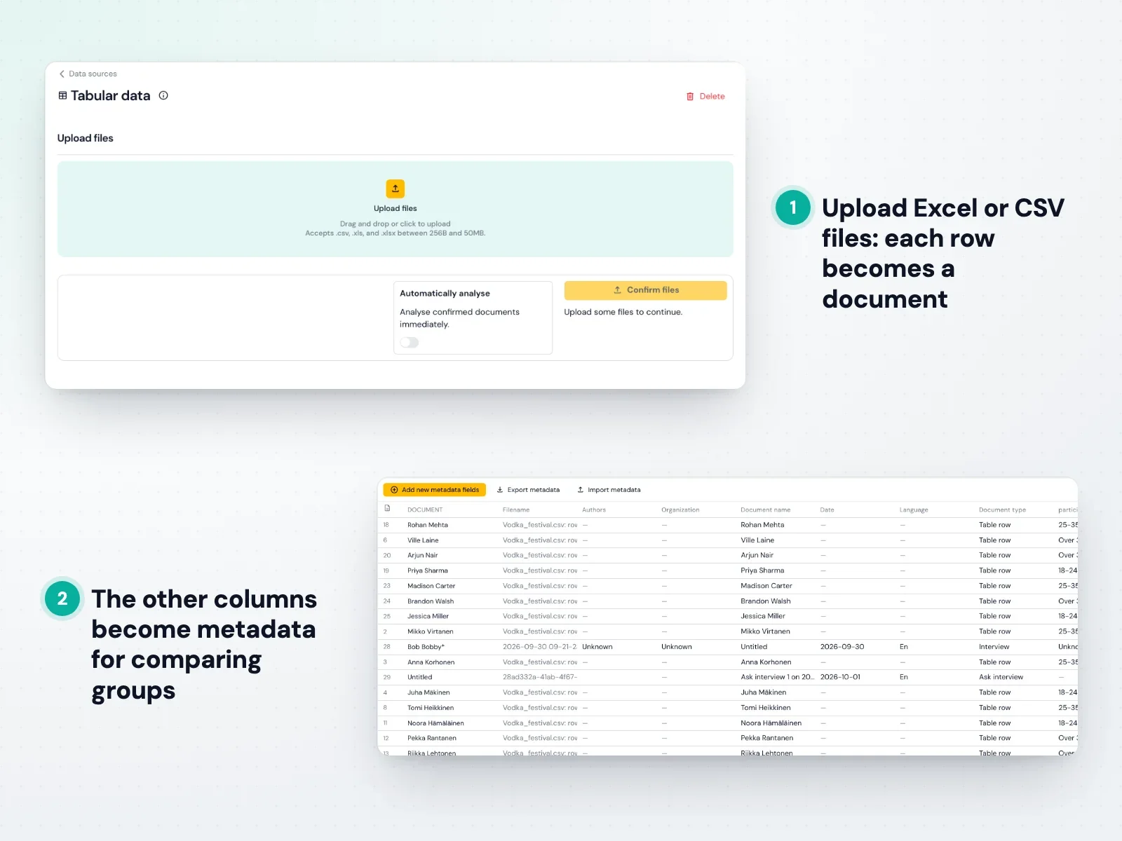
- Import them so that each answer is its own document and the other columns become metadata. In Skimle this is a standard Excel or CSV import, as the screenshot below shows.
- Run the analysis against your codebook using predefined categories, with inductive themes allowed for anything new.
- Review the "new" themes and decide whether to add them to the codebook.
How do you turn coded open-ends into a trend line?
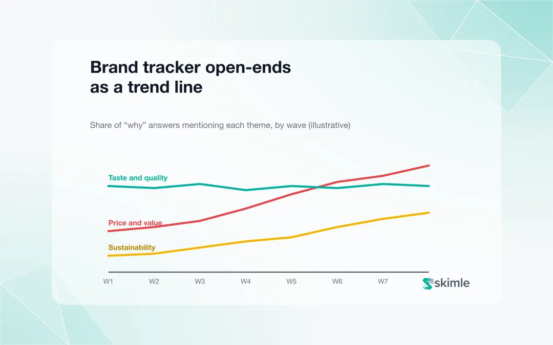
For each wave, calculate the share of respondents who mentioned each theme. Plot those shares across waves, as in the illustrative chart on the cover of this post: price and value rising, taste and quality steady, sustainability slowly climbing.
A few rules make the trend line trustworthy:
- Use respondents as the base, not answers. One long answer that mentions price three times is still one respondent.
- Show the base per wave. A spike in a wave with half the usual sample needs a caveat.
- Smooth where waves are small. For monthly trackers with small samples, a rolling three-month average is usually more reliable than single-month points.
- Mark codebook changes. If a code was introduced in wave 6, the line starts there. Do not back-fill earlier waves by assumption.
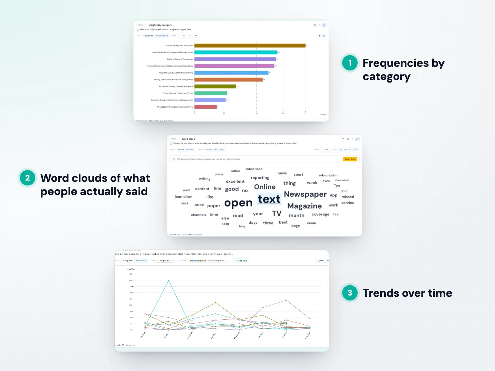
Skimle's trend views plot category shares over time from the wave or date metadata, and update as you refine the categories, as shown below.
If you run trackers for brands or clients, see how this fits the market research and customer insights workflow.
How do you link open-ends to brand KPIs?
The power of tracker open-ends is the link to the closed questions. Three analyses are worth running every wave:
- Themes by score group. Compare what promoters, passives and detractors (or high and low considerers) talk about. The themes that separate them most are your drivers.
- Themes behind a KPI movement. When a KPI moves, compare the theme shares of this wave with the previous one, within the same score group. The theme that moved with it is your first hypothesis.
- Themes by segment. Region, age, user versus non-user. A national trend is often driven by one segment.
Skimle's metadata analysis ranks every split by the size of the difference and describes what separates the groups, which is a fast way to run all three. Our guide to NPS verbatim analysis covers the score-group comparison in more detail.
What should a tracker open-end report look like?
Keep it short and tied to the KPI story the client already follows:
| Section | Content |
|---|---|
| What moved | The two or three themes whose share changed most, with the KPI they relate to |
| Why | Three or four verbatims per moving theme, from this wave |
| Who | The segment driving the change, if any |
| New this wave | Themes added to the codebook, with first appearance |
| Stable | A one-line note that other themes did not change meaningfully |
This turns the open-ends from an appendix into the explanation layer of the tracker.
Frequently asked questions
How many open-ended responses do you need per wave to see a trend?
For themes mentioned by 10% or more of respondents, about 300 answers per wave gives a reasonably stable share. For smaller themes, or for comparing segments, you need more, or should pool waves.
Should brand tracker open-ends be coded by AI or by people?
Both. AI can code every answer in every wave consistently against the codebook, which people cannot do at scale. People should own the codebook, review new themes and check a sample of the coding each wave. A tool that keeps the verbatim behind each coded answer makes that review quick.
What do I do with a codebook that has grown too big?
Review it once a year. Merge codes that are rarely used or always appear together, and retire codes that have stayed under 1% for a year. Keep a record of every change so earlier waves can still be read correctly.
Can I use AI sentiment scores instead of coding?
Sentiment tells you whether answers are positive or negative, not what they are about. It is a useful extra column, but it cannot explain why a KPI moved. Themes can. See our guide to customer sentiment analysis for where sentiment helps.
Sitting on years of tracker verbatims? Try Skimle for free: import your open-ends from Excel or CSV and see your themes trend across waves.
Related reading:
- How to analyse open-text responses at scale
- NPS verbatim analysis at scale
- Voice of customer research guide
About the author
Olli Salo is a former Partner at McKinsey & Company where he spent 18 years helping clients understand the markets and themselves, develop winning strategies and improve their operating models. He has done over 1000 client interviews and published over 10 articles on McKinsey.com and beyond. LinkedIn profile