Timeline trend
Chart how your categories, subcategories, and metadata values move over time.
Timeline trend answers one question: how does your coded material change over time? It lives in the Timeline lens of Visualisations and draws one series per category, subcategory, or metadata value, placed on a time axis by a date field from your metadata.
The five charts
The Chart control switches between five ways of drawing the same timeline. Each chart keeps its own settings, so you can flip between them without losing your place.
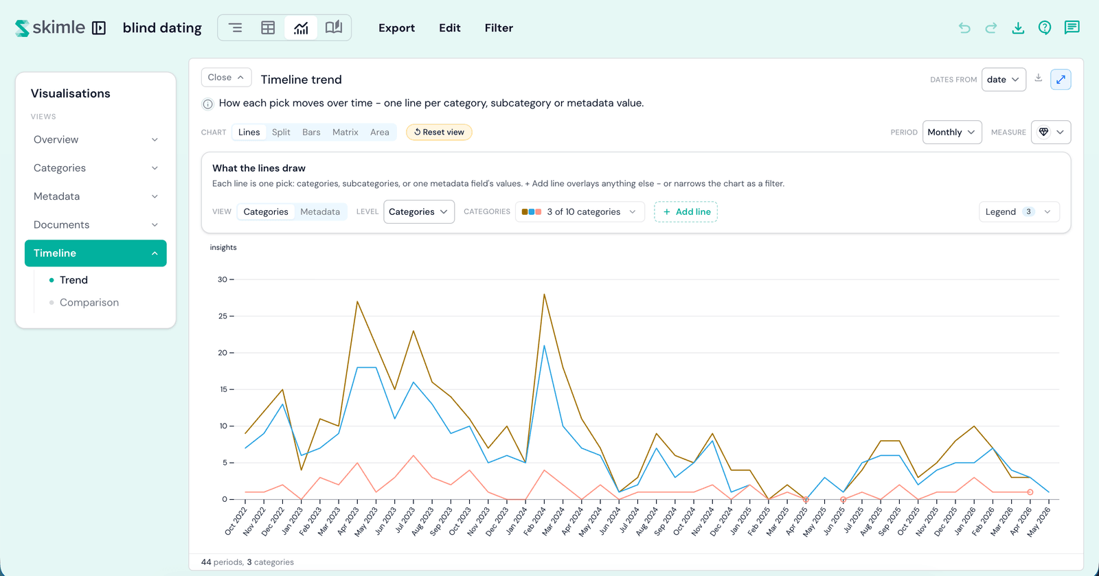
Lines
Every series as a line on a single chart - the default. The picker chooses up to 20 lines; click a legend pill to highlight one, and drag across the chart to zoom into a stretch of time (the Full range button clears the zoom).
Split
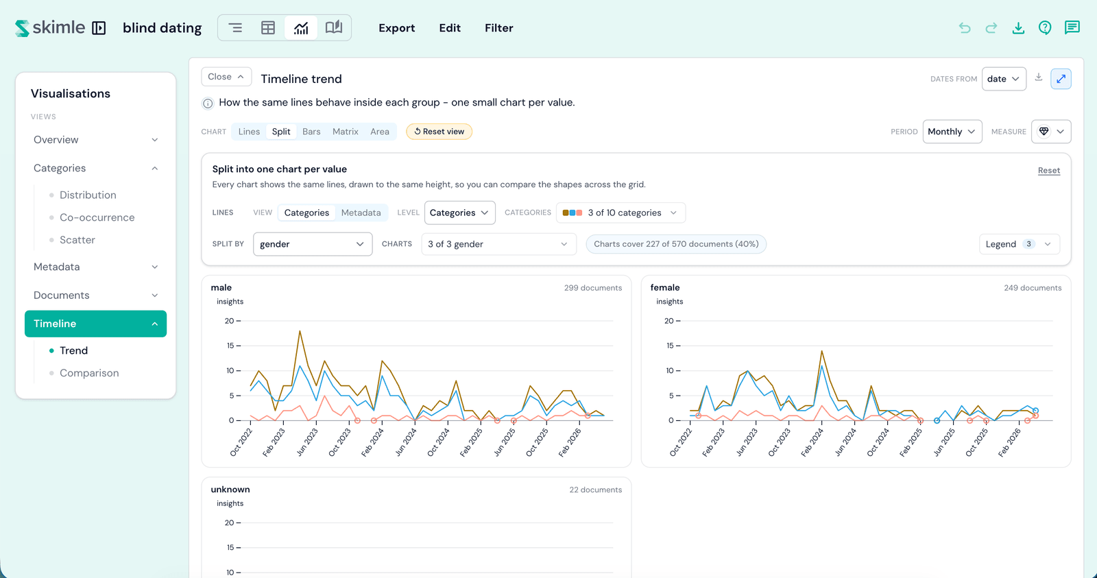
The same lines, drawn as a separate small chart for each value of a second dimension - a metadata field, or a tier of your codebook. Every chart uses the same scale, so you compare the shapes across the grid. A coverage pill tells you how many of your documents the drawn charts actually reach.
Bars
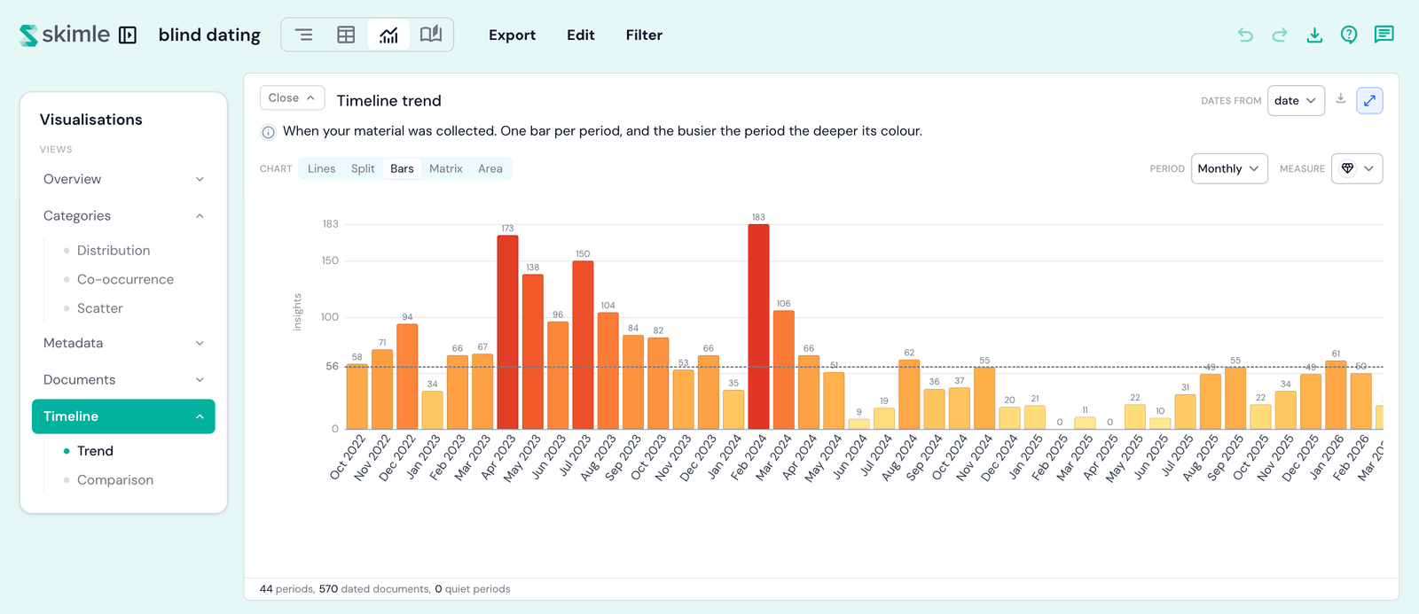
One bar per period: the whole material, no lines to pick. Use it to read the rhythm of your data - which periods were busy and which were quiet.
Matrix
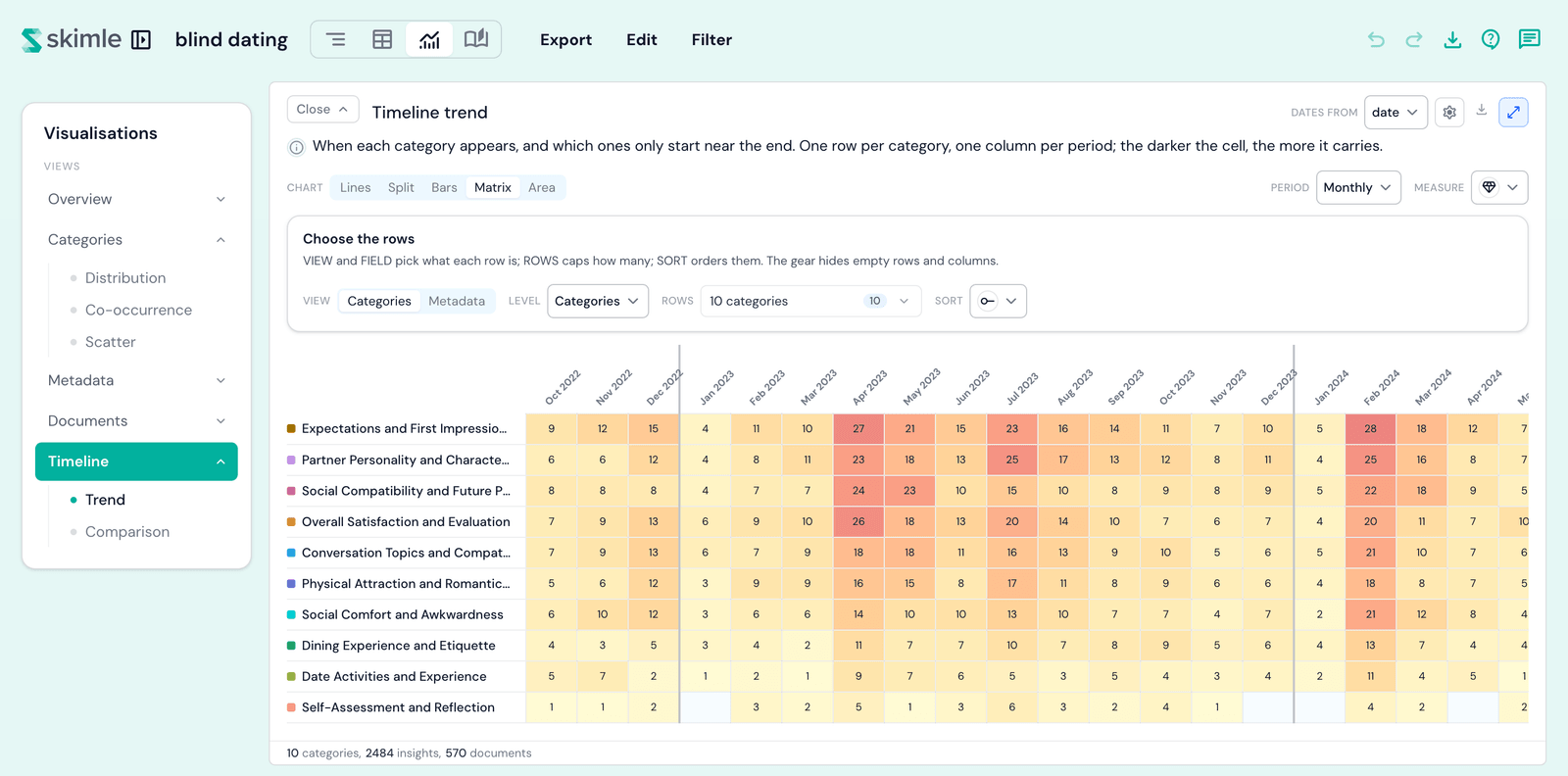
One row per category or metadata value, one column per period. Sort orders the rows by first seen, last seen, time span, or total volume, and Rows caps how many are shown. The gear hides empty rows (on by default) and empty columns (off by default - an all-zero period is real signal on a time axis).
Area
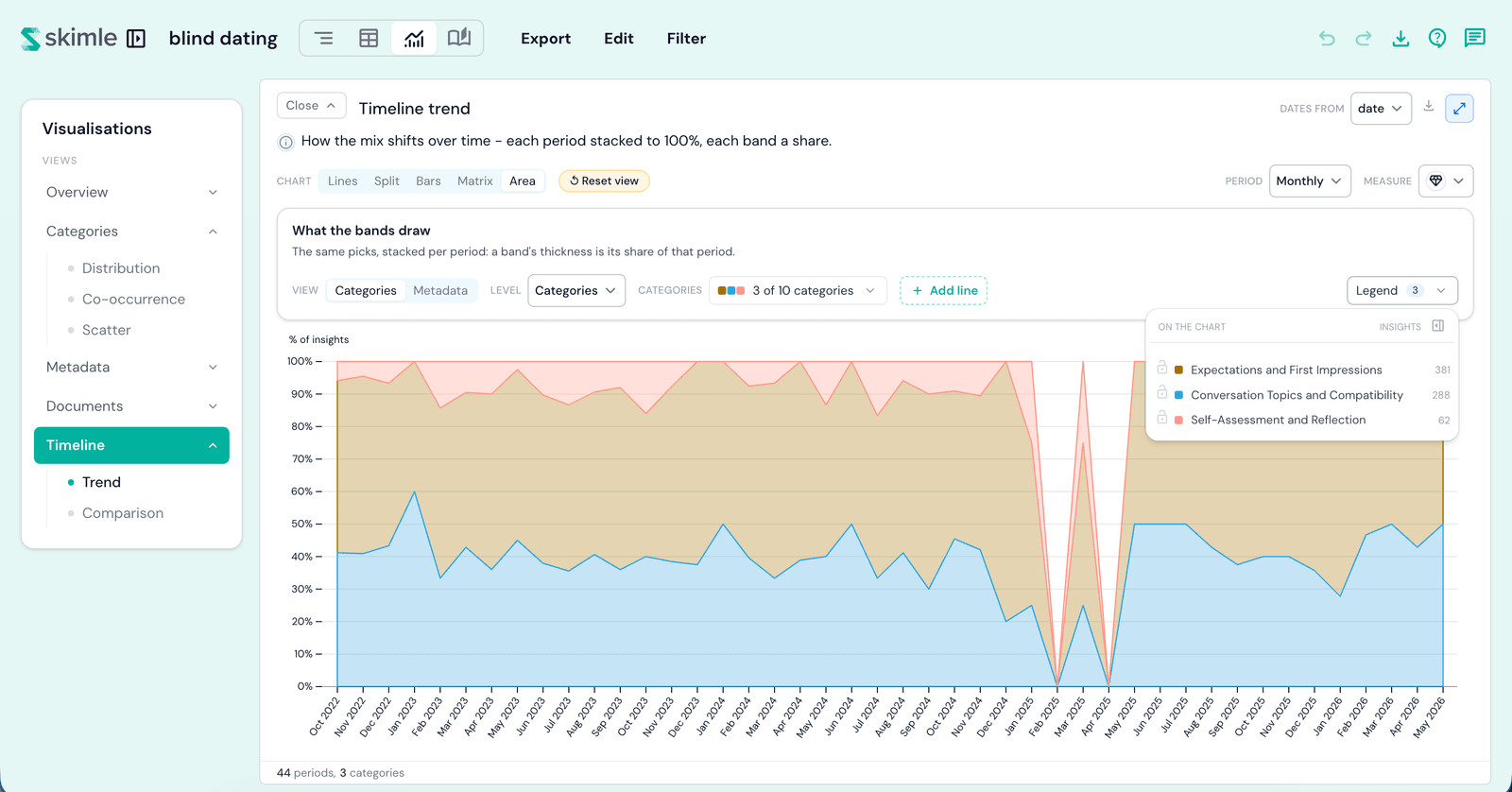
Each period stacked to 100%: a band's thickness is its share of that period, so you read how the mix shifts over time rather than how the counts rise and fall.
Choosing what is drawn
The picker row above the chart decides what each series is:
- View - whether the series come from your codebook or from a metadata field.
- Level - on the codebook side, how deep to read: roots, categories, or subcategories.
- Field - on the metadata side, which field's values become the lines.
- Values - which series are drawn, up to 20. The biggest ones are chosen for you; open the picker to choose your own.
- Period - how much time each point covers, from a day to a year.
Add line and filter chips
+ Add line overlays any category, subcategory, or metadata value as one more line, whatever the picker row is set to - so you can lay a metadata value over your category lines, or the reverse.
Each added line gets a chip above the chart. Click the funnel on a chip to flip it from a line into a filter: the chart then only counts material from the documents where that pick appears, and every line narrows to match. Click the funnel again to draw it as a line instead.
Dates from
The Dates from picker in the card header chooses which date field places each document on the axis. It is one choice for the whole Timeline lens, so changing it here changes it everywhere - including compare periods.
Measures
The Measure control sets what a point counts:
- Insights - how many insights the series collected in that period.
- % of insights - the series' insights divided by all insights from that period's documents.
- Documents - how many of the period's documents carry the series at least once.
- % of documents - the share of the period's dated documents that carry the series at least once.
Both shares divide by the period's own dated material, so undated documents never deflate them. On Bars the two % options are greyed out - Bars totals each period whole, so a share has nothing to divide - and on Area likewise, because Area already stacks each period into shares. The menu's footnote says so in both cases.
Reset
Each chart has its own Reset chart, which puts that chart's controls back to their defaults. It never switches you to another chart.
Drilling in
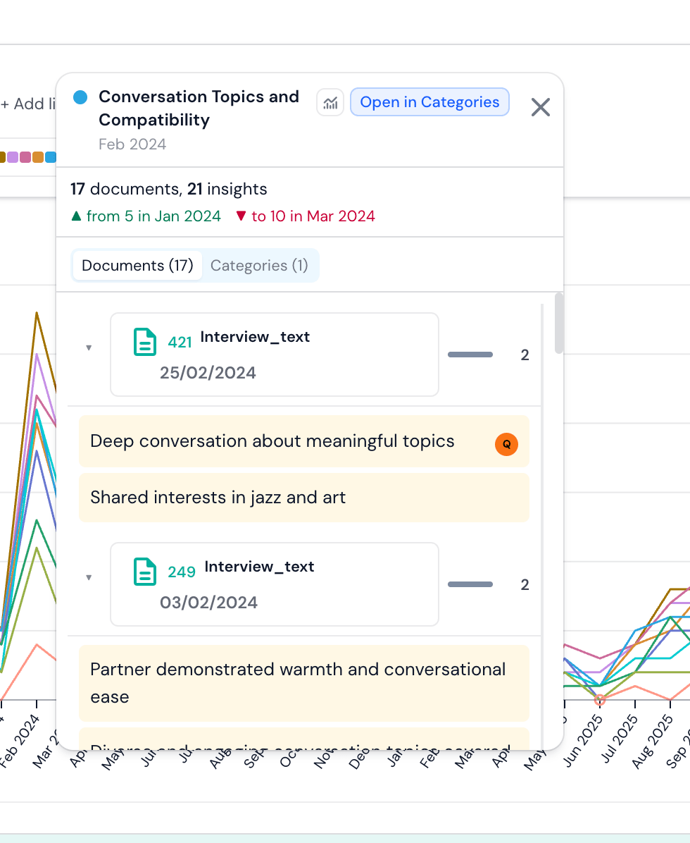
Hover anywhere on the chart to read exact values. Click a line, band, bar, or matrix cell to open the documents behind that period, grouped by document or by category - and from there, highlight the series on the chart or jump to the Categories or Metadata lens.