Visualisations
Explore patterns across categories, metadata, documents, and time with charts, heatmaps, and comparisons.
Visualisations is where you see the shape of your analysis at a glance: the charts, tables, and heatmaps behind your project, gathered on one page. It is especially powerful when your project includes metadata fields (see adding metadata), because you can see how categories and insights split across metadata values - and, if your documents carry dates, how they move over time.
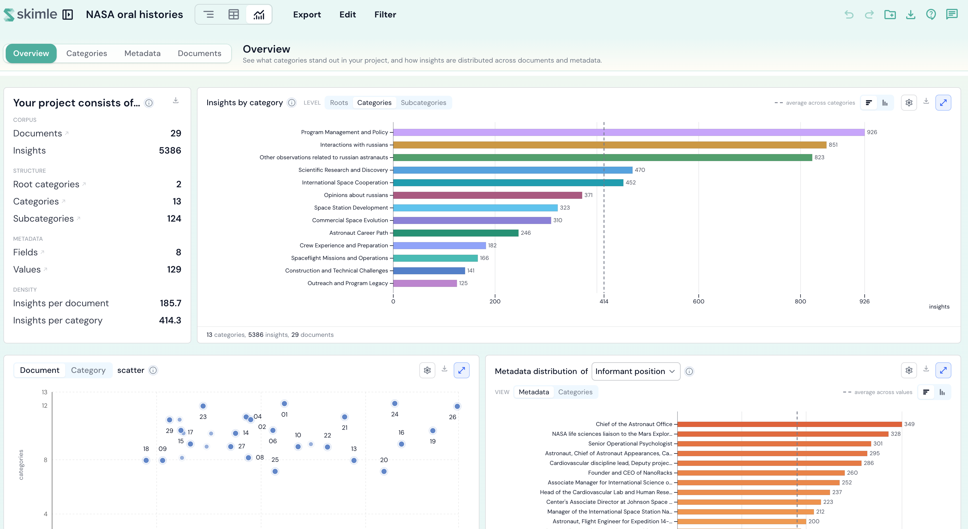
Getting around
Visualisations is organised into five lenses, listed down the left-hand navigation: Overview, Categories, Metadata, Documents, and Timeline. Each lens keeps its own focus, and its individual blocks are listed underneath it in the nav, so you can jump straight to the one you want:
- Overview - a quick glance at what stands out across the whole project.
- Categories - how your category tree behaves: which categories carry the most insights, how they split, and which tend to appear together.
- Metadata - how categories and insights split across each metadata field's values.
- Documents - a per-document breakdown of coverage and where insights appear.
- Timeline - how your material moves over time, and how a later period compares with an earlier one.
The lens you are on is remembered in the page address, so you can share or bookmark a link straight to the view you want.
Overview
The Overview lens is a high-level summary you land on first - you explore your analysis here; you edit the category tree itself in the categories view.
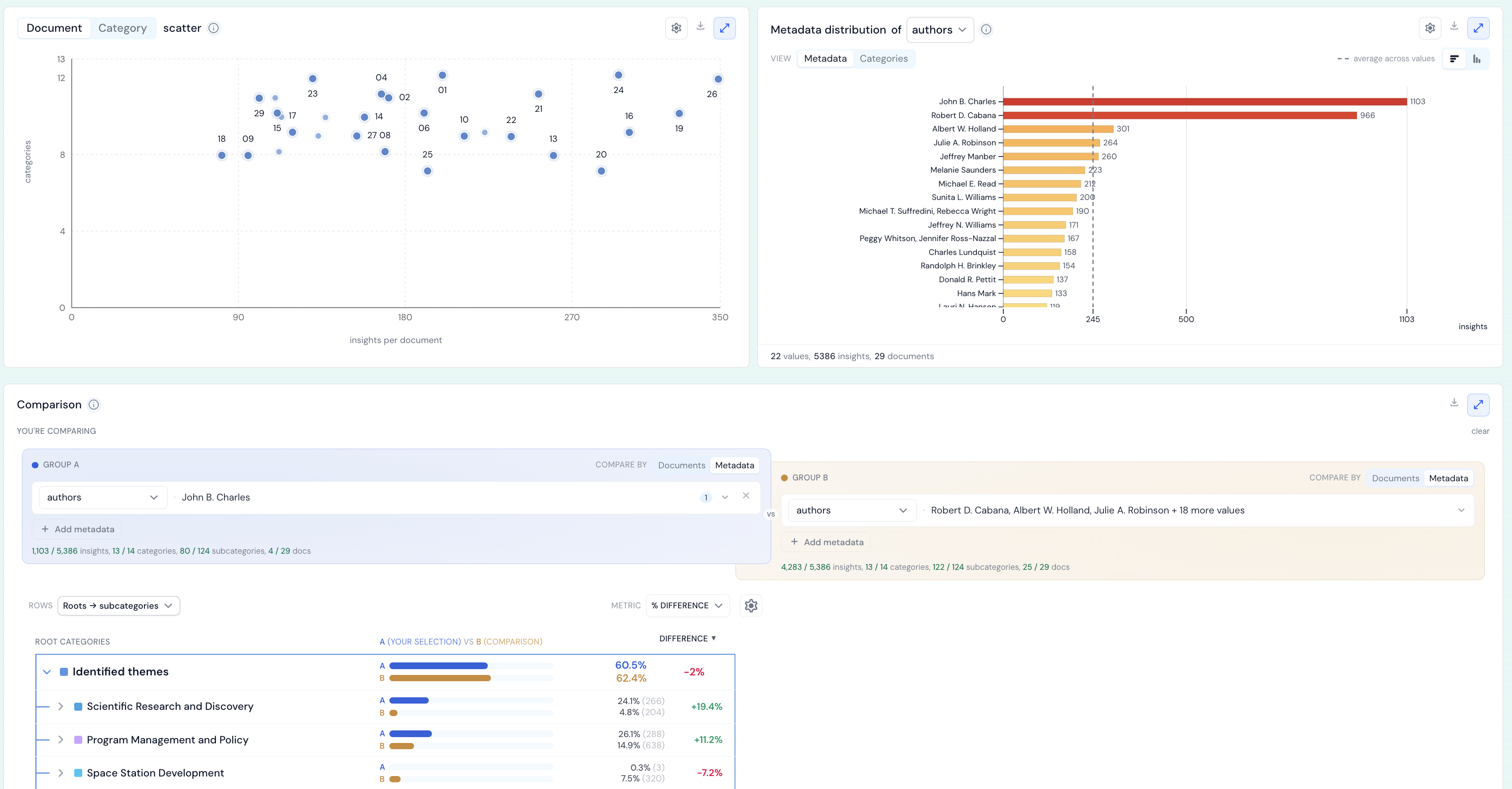
It opens with Explore your project through Visualisations, a welcome card that frames what each lens is for and folds away two references:
- Key statistics - the headline numbers behind your project, grouped into corpus (documents, insights), structure (root, categories, subcategories), metadata (fields, values), and density (insights per document and per category).
- Terminology - a plain-language glossary of the counts, colours, and toggles used throughout Visualisations (see reading the charts below).
Below the welcome card, the Overview lens shows:
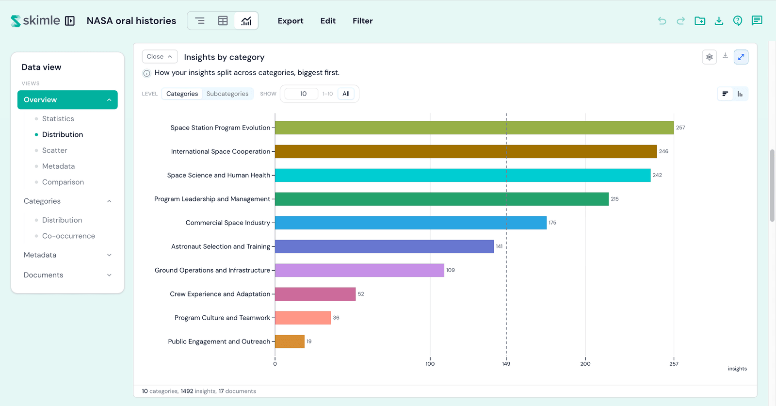
- Insights by category - the largest categories shown as simple distribution bars, with a level toggle to switch between categories and subcategories.
- Word cloud - what your documents talk about: the words they use, or the people, places, and topics they name (see the word cloud teaser below).
- Metadata distribution - the composition of your sample for a metadata field you choose, which you can also break down by category.
- Comparison - a live side-by-side (Group A vs Group B) that contrasts two subsets of your data (see comparison below).
Word cloud
The word cloud shows what your documents talk about, sized by how much of the project talks about it. Switch the source between Words (the vocabulary your documents actually use) and Entities (the people, places, organisations, and topics the analysis found), lay the items out as a cloud, a text block, or ranked bars, and click any item to see the documents behind it. Read the full chapter: word cloud.
Reading the charts
Most blocks share a small set of controls, explained in full under Terminology in the Overview welcome card. The main ones are:
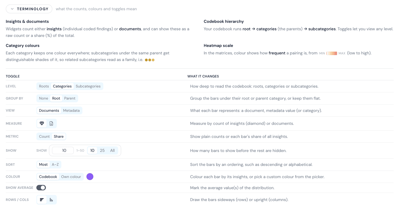
- Level - how deep to read the codebook: roots, categories, or subcategories.
- Group by - group the bars under their root or parent category, or keep them flat.
- View - what each bar represents: a document, a metadata value, or a category.
- Measure - count by insights or by documents.
- Metric - show plain counts or each bar's share of the total.
- Show - how many bars to display before the rest are hidden.
- Sort, Colour, Show average, and Rows / cols - control the ordering, the colouring, the average marker, and whether the bars run sideways or upright.
Categories keep the same colour everywhere, and subcategories under the same parent get distinguishable shades of it, so related subcategories read as a family. In the heatmaps, colour shows how frequent a pairing is, from low to high.
Categories
The Categories lens focuses on the health of your codebook and how categories relate to one another.
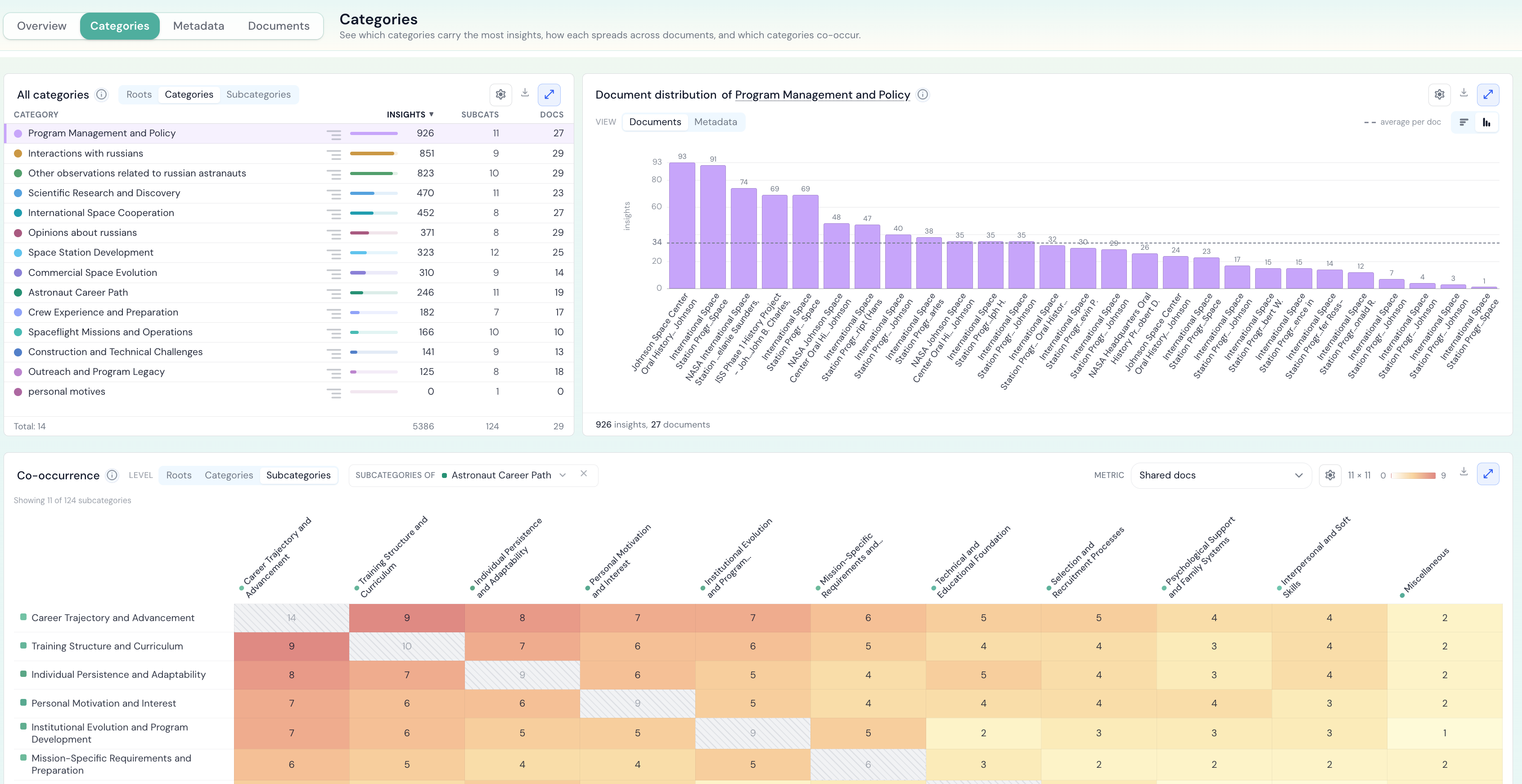
It shows:
- Category distribution - pick a category from the list on the left to see how its insights spread across your documents or metadata values. Switch the granularity between categories and subcategories, and the breakdown between documents and metadata.
- Co-occurrence - a category-by-category heatmap showing which pairs of categories tend to turn up in the same documents, with a selectable metric and a level toggle for categories or subcategories.
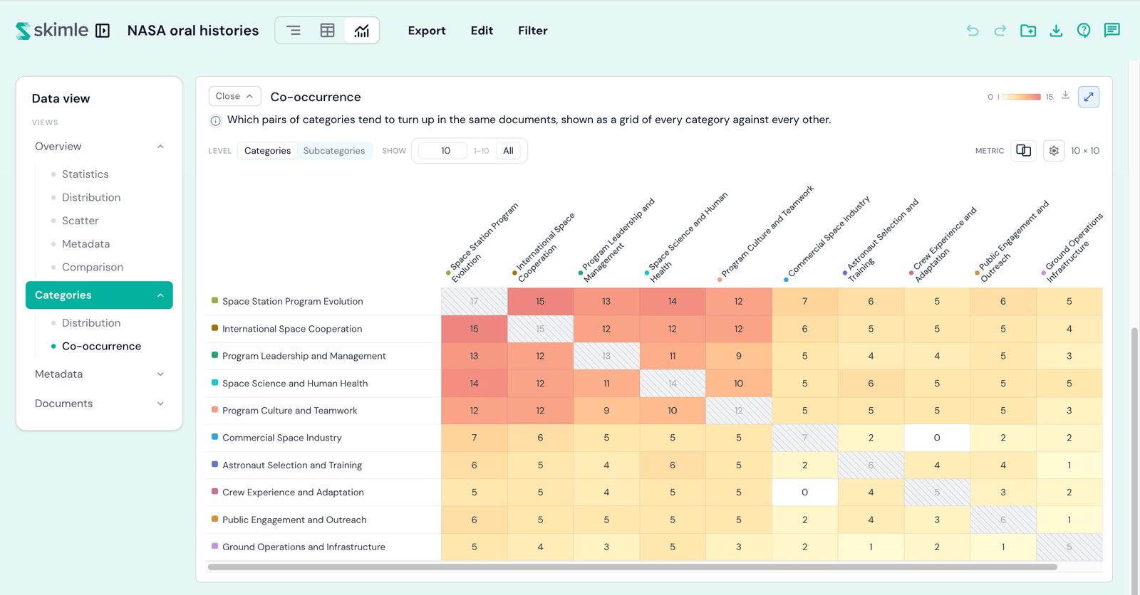
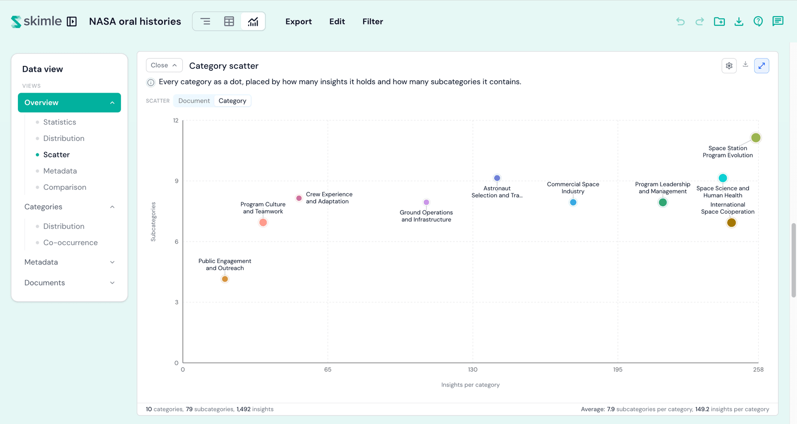
- Scatter - every document, or every category, plotted as a dot so outliers are easy to spot. A View toggle switches between across documents (each document placed by how much and how broadly it was coded) and across categories (each category placed by how many insights it holds and how many subcategories it contains).
Metadata
The Metadata lens shows how your categories and insights are distributed across metadata fields.
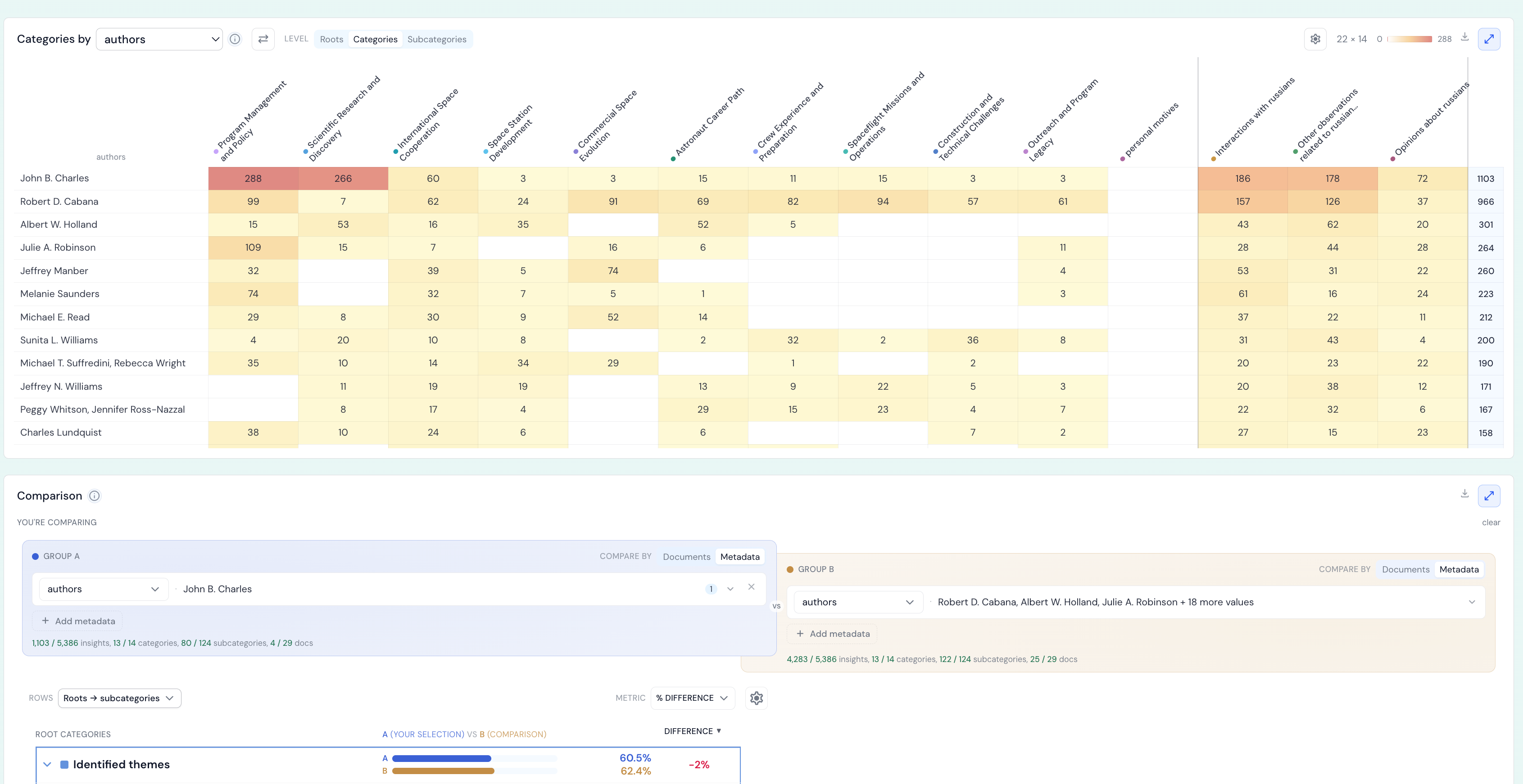
It shows:
- Metadata distribution - the list of your metadata fields, each with its number of values and coverage. Pick a field to see which of its values are most common, and how the documents behind it spread across them; you can also break the field down by category.
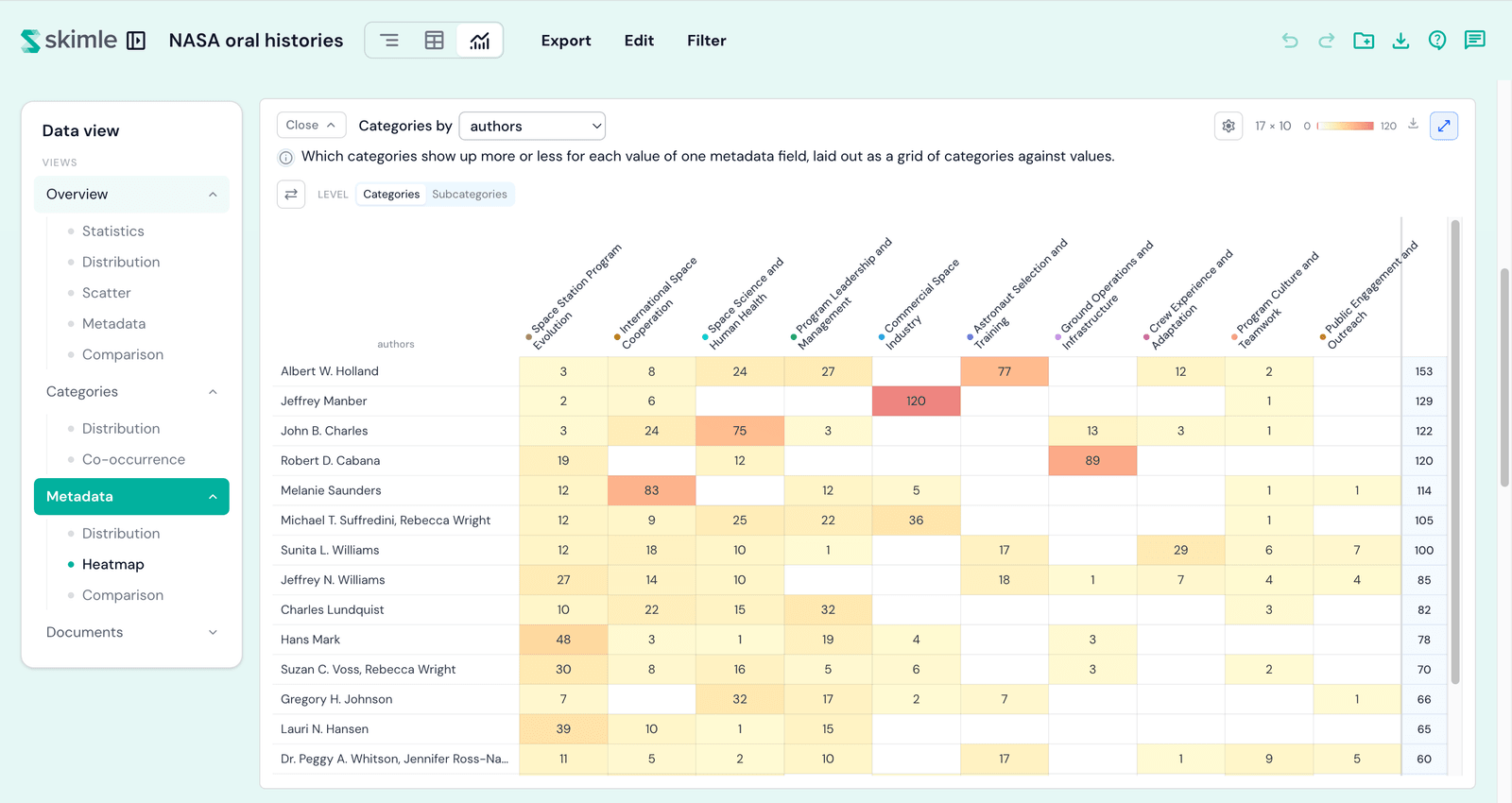
- Categories by metadata - a full-width heatmap showing which categories show up more or less for each value of one metadata field, laid out as a grid of categories against values. Click any cell to open the insights behind it.
- Comparison - a side-by-side seeded by the field or value you selected.
Documents
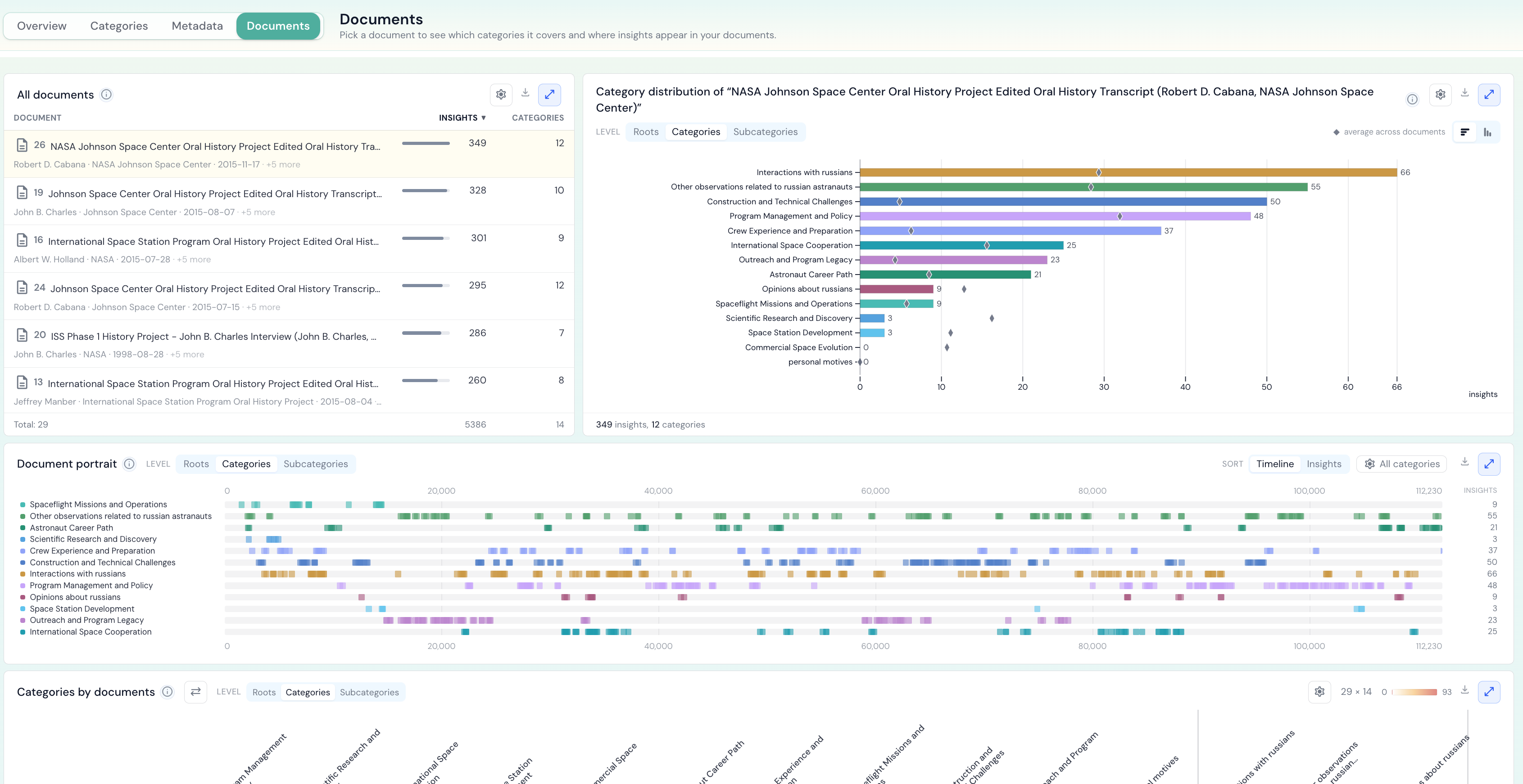
The Documents lens gives you a per-document view of your analysis.
It shows:
- Document distribution - your documents ranked by how much each is coded, with the metadata of the selected document alongside. Pick a document to chart how its insights spread across the categories.
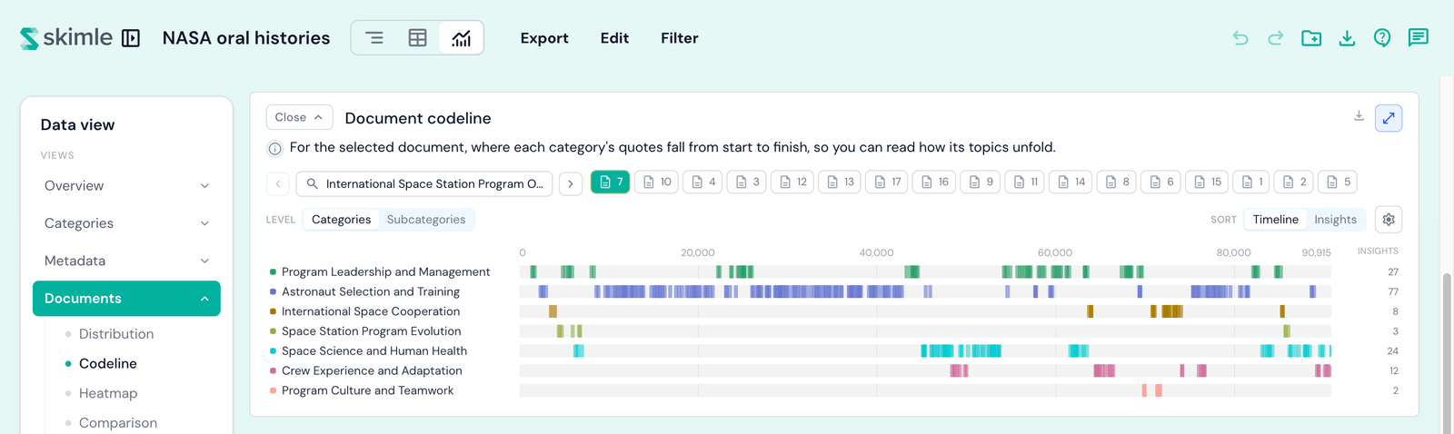
- Document codeline - for the selected document, where each category's quotes fall from start to finish, so you can read how its topics unfold.
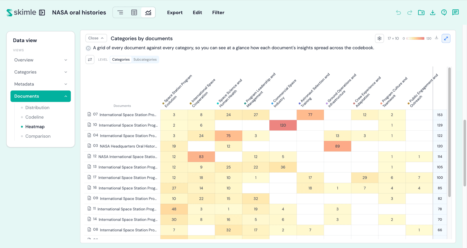
- Categories by documents - a grid of every document against every category, so you can see at a glance how each document's insights spread across the codebook.
- Comparison - a side-by-side seeded by the selected document.
Timeline
The Timeline lens reads your project against time, using a date field from your document metadata. The Dates from picker in each card's header chooses which field places the documents on the time axis - one choice for the whole lens. It holds two blocks:
Timeline trend
Five charts - Lines, Split, Bars, Matrix, and Area - that show how your categories, subcategories, or metadata values move over time: one line per pick, one bar per period, one row per value, or each period stacked into shares. Read the full chapter: timeline trend.
Compare periods
Mark an Earlier and a Later range of documents on a calendar strip, and see which categories grew and which shrank between them. Read the full chapter: compare periods.
Compare periods contrasts two ranges of time; the comparison below contrasts two groups of documents or metadata values. Reach for whichever matches your question.
Comparison
The comparison contrasts a group you pick - documents or metadata values - against the rest of the corpus, and highlights the categories where your selection stands out most.
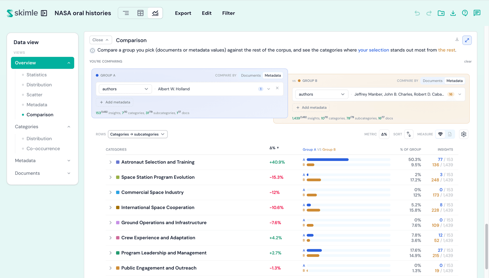
- Group A vs Group B - choose each side by documents or metadata values. Left unset, Group B defaults to the rest of the corpus, but you can pin it to a group of your own.
- Metric - read each row as a percentage-point difference (the gap in share between the two groups), times as common (how many times more common a category is in one group than the other; a category only one group mentions reads A only or B only), or an odds ratio.
- Sort, rows, and measure - order the rows, choose the codebook level, and measure by insights or documents. The difference sorts follow the metric you pick.
The comparison feeds off the Overview, Metadata, and Documents lenses: clicking a document or metadata value seeds it, so you can quickly compare two subsets of your data. To compare an earlier and a later slice of your project instead, use compare periods in the Timeline lens.
Working across the lenses
A few features are shared across all five lenses:
- Enlarge - most cards can be opened full-screen using the enlarge control in their header, and some pairs of cards open together so you keep the master-and-detail context.
- Export - each chart can be copied as an image, downloaded as a PNG, or downloaded as CSV data from the card's menu, so you can drop figures straight into a report.
- Filter - narrow the whole of Visualisations to a subset of documents, categories, or metadata values from the Filter control in the top bar; every block updates to match.
- Hand-off between lenses - clicking through from one lens (for example, opening a category or document) carries your selection into the destination lens so you keep your place.
For a quick reference of which dimensions each block can explore, see Visualisations settings.